
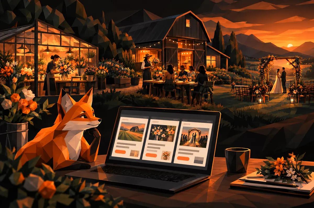
If you run a farm that also grows flowers, designs arrangements, hosts small weddings and teaches workshops, you do not have one business. You have four. Your website probably treats them as one.
That is the problem this post is about. Here is what a florist and farm workshop booking website has to do, and why the answer is more structure, not more pages of text.
Why one contact form fails a farm with four businesses
A single "Contact us" form asks everyone the same thing. A woman who wants a Saturday wreath class and a couple planning a ceremony among the rows are not the same visitor. They do not have the same questions or the same budget. They are not in the same hurry.
Put them through one form and you get one of two results. The form is vague, so you spend your week asking follow-up questions. Or the form is long, so the workshop buyer quits halfway through.
Bhumi & Bloom Co. is the example we keep coming back to. It is a working regenerative farm, a floral studio, a micro-wedding venue and a workshop program under one name. The site we built for them starts from that fact. A generic template would have flattened four offers into a list of services. We did not want that.
Should each revenue line get its own page?
Yes. Without exception.
A shared page makes your offers compete. The wedding inquiry buries the workshop calendar. The farm story pushes the bouquet pricing below the fold. Visitors scroll, get lost and leave.
Give each line room to sell on its own terms:
- Workshops: what you will make, when, how long, what to bring, how to book.
- Micro-weddings: the venue, the setting, what is included, how to start a conversation.
- Floral studio: the kinds of work you take on and how to ask for it.
- The farm: what you grow and how you grow it.
Each page can then speak to one person. A shared home page points to all four and lets visitors pick their own door.
How to let photography of the land and flowers carry the story
People pick a small local farm over a wire-service florist because of place. They want to see the field, the light and the actual flowers they could be holding.
So the layout should get out of the way. Large images. Short captions. Your own photographs, not stock bouquets that could belong to anyone.
On the Bhumi & Bloom site, image-forward layouts let photography of the flowers, produce and land carry the brand's story. The words support the pictures, not the other way around.
A practical rule: if a photo could appear on a competitor's site without anyone noticing, replace it. Your mud, your rows and your barn are the point.
Why regenerative and spray-free practices belong near the top
Most farms bury this. A line in the footer, or a paragraph on an About page nobody opens.
That is a mistake. Spray-free, regenerative growing is the thing that separates you from every other florist in the Triangle. It is a reason to choose you, so treat it like one.
On the Bhumi & Bloom site, we wrote and designed the copy hierarchy so those practices read as the differentiator, not a footnote. They sit where a visitor sees them early, in plain language.
Say it in one clear sentence near the top of each relevant page. Then show it with images of the land. Save the longer explanation for visitors who want it.
What a workshop visitor needs to see before they inquire
A workshop buyer is usually deciding in a few minutes whether this is a good way to spend a weekend. Make that easy.
Before they reach your form, they should see:
- What they will actually do and take home.
- Dates, times and how long it runs.
- Where it is, with a photo of the setting.
- The price, or at least a clear starting point.
- What to do next, in one obvious button.
Then keep the form short. Name, email, which workshop, how many people. That is a booking, not an interview.
If the question is "can I get a seat?", the path should feel like a yes-or-no, not a consultation.
What a micro-wedding couple needs that a workshop buyer does not
A couple is making one of the biggest decisions of their year. They need to trust you before they write.
That means more room on the page. Show the venue in different light. Explain what the day looks like and what is included. Let the spray-free, regenerative story do real work here, because many couples care where their flowers come from.
Their form should ask different things too: a possible date, a rough guest count, what they are picturing. It should read like the start of a conversation with a person, not a ticket.
And it should be clear that you are a small venue. That is the appeal. Do not apologize for it.
How to build inquiry paths that follow different routes
An inquiry path is everything between "I am interested" and "I have sent my details." For a multi-offer farm, each path should be built for its visitor.
- Different forms. Each offer asks its own questions.
- Different buttons. "Reserve a seat" and "Plan your day" tell visitors they are in the right place.
- Different confirmations. A workshop buyer wants to know their seat is held. A couple wants to hear that a person will be in touch.
- Different destinations. Each inquiry should land with whoever actually answers it.
That last one is easy to forget and it matters most. A good form that lands in the wrong inbox is a bad form.
This is what we built for Bhumi & Bloom: inquiry paths tuned to each offer, so a micro-wedding lead and a workshop booking follow different routes. If you are curious how this kind of structure is built, our custom web development work covers it.
How to add a new offer later without rebuilding the site
Farms change. Maybe next year there is a fall dinner, a subscription or a new class series. The site should be able to take it.
The answer is to build offers as repeatable pieces. Each one has the same bones: a hero image, a short pitch, the details a buyer needs and its own inquiry path. Adding one is then a matter of filling in a new page, not redesigning the navigation.
Ask your developer one question before you sign anything: "How would we add a fifth offer?" If the answer involves starting over, keep looking.
We cover more of what this industry needs on our farm and florist website design page.
Your next step
Open your site and click through it as a stranger who wants only one thing: a workshop seat, then a wedding date. Count the clicks and the questions. If both visitors end up at the same form, you know where to start.
When you want a second set of eyes, tell us about your farm.