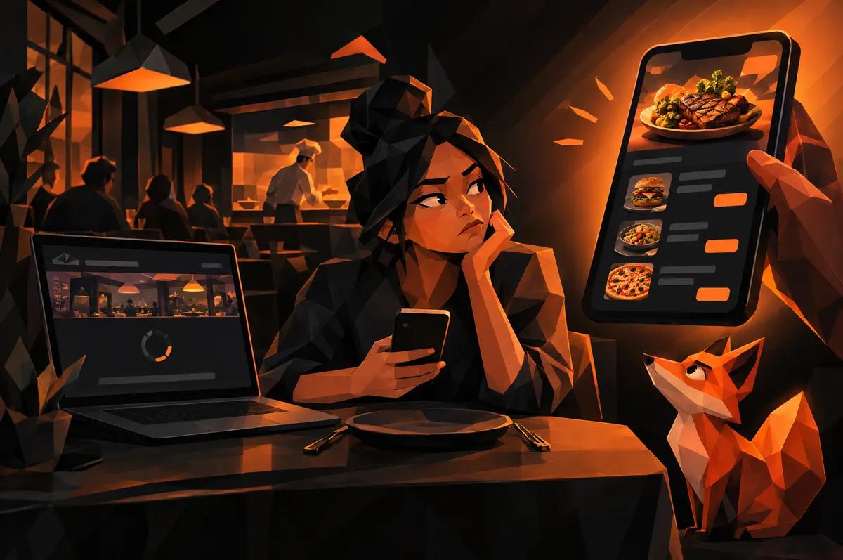
A diner is standing on a downtown sidewalk. Hungry, a little indecisive, phone in hand. They search for your restaurant, and your site takes its time. So they open a delivery app instead.
That is the whole problem with restaurant website vs delivery app. It is not a debate about philosophy. It is a race measured in seconds, and the app is already warmed up.
Why do hungry diners open a delivery app instead of your website?
Because the app answers the question they have. What can we eat, is it open, where is it.
A slow site makes them wait for those answers. A confusing one makes them hunt. The app asks for neither.
Most restaurant sites lose the race for dull reasons:
- A hero video that loads before anything useful
- A menu buried behind a menu of menus
- Hours hidden in the footer
- A popup asking for an email before the diner has eaten anything
None of those are branding problems. They are friction, and a hungry person has very little patience.
What must be one tap away on every screen?
Three things: the menu, the hours, and the location.
That is what a hungry visitor came for, so that is what the site should hand over first. It was our starting rule for Las Mas Mexican Kitchen & Bar in downtown Wake Forest. Menu, hours and location sit within one tap of every screen. Not just the homepage. Every screen.
Why every screen? Because people do not arrive where you expect. They land from a Google search on an inner page, a social post, or a friend's text. If the essentials only live on the homepage, plenty of visitors start in the wrong place.
A small, obvious bar pinned to the top or bottom of the phone screen does this job well.
How should the menu be built for a phone in someone's hand?
Assume one thumb, bright sun, and spotty signal.
That rules out the scanned PDF. Diners pinch, zoom, lose their place and give up. A menu built as real text on the page loads fast, reads cleanly and can be found by search engines.
Some practical rules:
- Short section headings the diner can jump between
- Dish names and prices that line up and stay readable at arm's length
- Dietary notes written plainly, not hidden in an icon legend
- No horizontal scrolling, ever
Treat the menu as the most important page on the site, because it is. Design it first, then build the rest around it.
Why do hours and address need to match Google exactly?
Because for many diners, Google is the first version of your website they see.
If your site says one closing time and your Google listing says another, someone gets turned away at the door. They will not blame Google. They will blame you, and they may not come back.
Local search and mobile behavior is what drives walk-in traffic to a downtown restaurant. So at Las Mas, local SEO was part of the build, not an afterthought.
The fix is boring and worth doing:
- Use the same name, address and hours everywhere
- Update holiday hours in every place at once
- Make the address on the site tappable, so it opens directions
How does food photography do the selling instead of adjectives?
"Authentic, handcrafted, made with love" has been on every menu since menus existed. Nobody believes it anymore.
A good photo of the actual plate beats all of it. The diner sees the food, wants the food, and walks over. Appetite-forward layouts give photography room to work: large images, tight text, and nothing crowding the dish.
For Las Mas, the photography does the selling rather than the adjectives. Copy still matters, but its job is to support the picture. Name the dish, say what is in it, and stop.
A few reminders:
- Shoot your real food, in your real room
- Compress images so they do not slow the page
- Put photos beside the items people ask about most
How can a long family history sit inside the site without slowing it?
Twenty-five years in one place is an asset. It is also a trap.
The usual move is to give the story its own About page, and then nobody reads it. The diner who came for the menu never clicks over, and the story that earns loyalty goes unseen.
We took a different route at Las Mas. The twenty-five-year family story is woven through the site instead of quarantined on an about page. Short pieces, placed where a diner is already looking.
None of them stands between the visitor and the menu. The story arrives while the diner is on the way to a decision. That is when it works hardest.
What does a restaurant gain from owning the visit?
A delivery app owns the customer relationship. Your site can own it instead.
On your own site, the diner sees your menu, your photos and your story, with nobody else's logo in the way. You choose what they see first. You are not one tile in a list of competitors.
For a walk-in restaurant, that matters even more. The goal is a person at your door, not an order on someone else's platform. A site that gives directions in one tap turns a search into a table.
People also remember a restaurant they found on its own site. They are more likely to search for it by name next time.
What should a Wake Forest or Triangle owner check this week?
Do this on your own phone, on mobile data, not office Wi-Fi.
- Search your restaurant name. Count the seconds until you can see the menu.
- Find the hours. Do they match your Google listing exactly?
- Tap for directions. Does it work in one tap?
- Open your menu. Is it real text, or a PDF you have to pinch?
- Look at your photos. Do they show your actual food?
If any step fails, that is where diners are leaving. Run your site through our speed test for a quick read on how it loads.
If you are in Wake Forest, our Wake Forest web development page shows how we work with local businesses. Start with step one tonight, and fix whatever fails first.