
Picture a single contact form on a farm's website. A couple planning a micro-wedding fills it out. So does someone curious about a flower workshop. Both land in the same inbox with the same blank message box.
Now someone has to untangle that. It is slow, and it makes both people feel like a ticket in a queue.
That is the problem we took on with Bhumi & Bloom Co. Here is how the site was built, and what you can borrow if your own business sells more than one thing.
Why does a business with four offers need four doors?
Because four offers means four kinds of customer.
Bhumi & Bloom is a working regenerative farm, a floral studio, a micro-wedding venue and a workshop program. Under one name, that is four businesses. Each one speaks to a different person with a different reason for showing up.
A website with separate inquiry paths for each service is not extra work for its own sake. It is how each of those people finds the thing they came for without wading through the other three.
One front door for four businesses sounds tidy. In practice it is a hallway where everyone bumps into each other.
What was the brief for Bhumi & Bloom Co.?
The brief was short and hard.
Hold all four businesses on one site. Do not let a generic template turn them into an unfocused list of services. And keep the sense of place that makes people choose a small local farm over a wire-service florist.
That last part matters most. Anyone can order flowers from a catalog. People come to a farm because they want to know where things grow and who grows them.
So the site had two jobs at once. Give each business its own room to sell. Keep all of it feeling like one place you could actually visit.
You can see the finished work on the Bhumi & Bloom case study page.
How do you structure a site around revenue lines?
Start with how the business makes money, not how it is organized internally.
We structured the site around the four revenue lines. Each has room to sell on its own terms, rather than competing with the others on one crowded page.
Here is why that works:
- A visitor who wants a wedding venue is not asked to scroll past workshops first.
- Each offer can use its own language, its own pictures and its own proof.
- The business can add or adjust one line without disturbing the rest.
The shared thread is the farm itself. The brand ties the four together. The structure keeps them from tripping over each other.
If you run a farm, florist or similar business, our page on farm and florist website design covers how we think about this kind of site.
Why does a micro-wedding lead need a different path than a workshop booking?
Because they are making different decisions.
Someone looking at a micro-wedding venue is making a big, personal choice. They are likely to want to ask questions, picture the day and feel sure before they reach out. Someone looking at a workshop is closer to picking an experience they can sign up for.
Those are different moods, different stakes and different next steps. We designed inquiry paths tuned to each offer, so a micro-wedding lead and a workshop booking follow different routes.
The practical effect is simple. Each person is asked the questions that fit their situation, not a generic set that fits nobody. The business gets a lead that already says what kind of lead it is.
That is the real argument for tuned paths. It is not about looking organized. It is about starting every conversation one step further along.
How does the copy make regenerative farming the differentiator?
By putting it up front instead of tucking it away.
Plenty of florists can say their flowers are pretty. Few can say they grow them on a regenerative farm without spraying. That is the thing a competitor cannot copy by changing a headline.
So we wrote and designed the copy hierarchy so the farm's regenerative, spray-free practices read as the differentiator, not a footnote.
In practice, that means the most important claim gets the most visual weight. It is not buried in an "about" paragraph that three percent of visitors read. It shows up where decisions get made.
A good test for your own site: cover the logo and read the top of your page. Could a competitor say the same thing? If yes, your differentiator is hiding.
This is also brand work, not just copywriting. If your story needs sharpening before the site can tell it, that is what brand development is for.
How do photos of flowers, produce and land carry the story?
They do the convincing that paragraphs cannot.
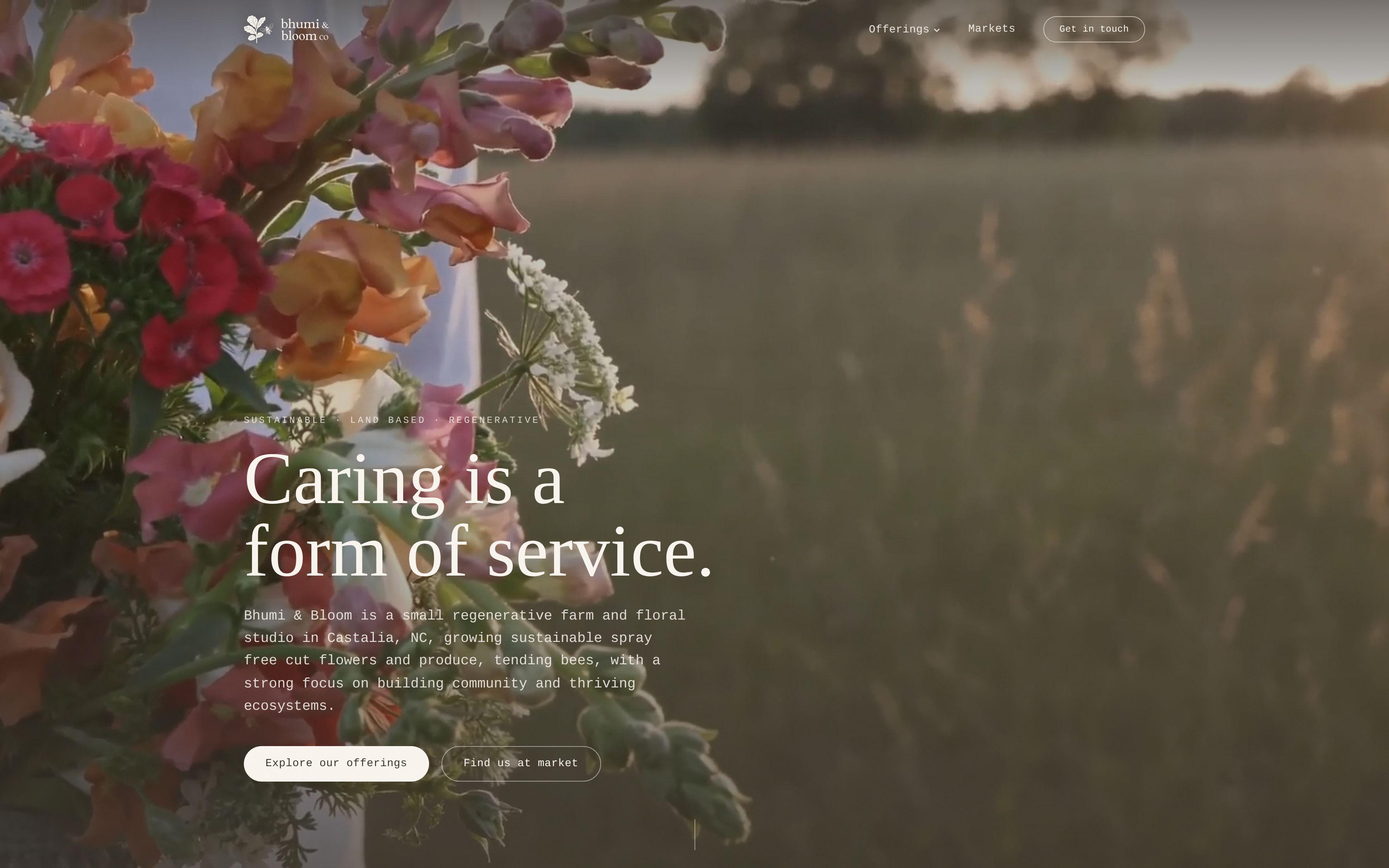
We built image-forward layouts that let photography of the flowers, produce and land carry the brand's story. A farm is a physical place. Words can describe it, but a photo of the actual rows and the actual blooms proves it.
Image-forward does not mean decorative. It means the layout gives photos room to lead and lets the text support them.
Three kinds of image each do a different job:
- Flowers show the quality of the work.
- Produce shows this is a working farm, not a backdrop.
- Land shows the place people would be visiting or getting married on.
Stock photos cannot do any of this. A stock bouquet could come from anywhere, which is exactly the problem a local farm is trying to avoid.
What does a one-size contact form cost a multi-offer business?
It costs clarity on both sides.
The visitor has to guess what to write and how much to say. The business gets messages that mix up wedding dates, class questions and everything between, and has to sort them by hand before answering.
Worse, a generic form quietly tells the visitor they are one of many. A couple planning a wedding does not want to feel like they are filling out the same form as someone asking about a class.
It also flattens your offers. If every service funnels into one box, they all look like the same thing with different names. The customer cannot tell which is your flagship and which is a side offer.
Our position is plain. If your business has more than one distinct offer, one generic contact form is a mistake. It is the cheapest part of the site to build and one of the most expensive to live with.
How do you decide how many inquiry paths your site needs?
Count the different buyers, not the different services.
Ask three questions about each offer:
- Is the buyer different? A bride and a hobbyist are not the same person.
- Is the decision different? A big commitment and a quick sign-up need different handling.
- Is the next step different? If you would respond differently, the path should differ too.
If an offer answers yes to any of these, it likely earns its own path. If two offers share the same buyer, decision and next step, they can share a door.
Do not build more paths than you can answer well. Four paths that get a prompt, thoughtful reply beat six that pile up unread.
Where to start
Open your inbox and look at your last ten inquiries. Sort them by which offer each person was really asking about. If you spend more than a minute doing it, your site is not sorting them for you.
If that sounds familiar, tell us about your business. We will tell you honestly how many doors it needs.