
If you run a design or media studio in Raleigh, your website has a problem no other local business has to think about. It isn't just marketing. It's a sample of your work. A restaurant's site can be fine. A law firm's site can be plain and nobody blinks. But when a potential client lands on a creative studio's homepage, they are already grading your taste before they read a word about your services.
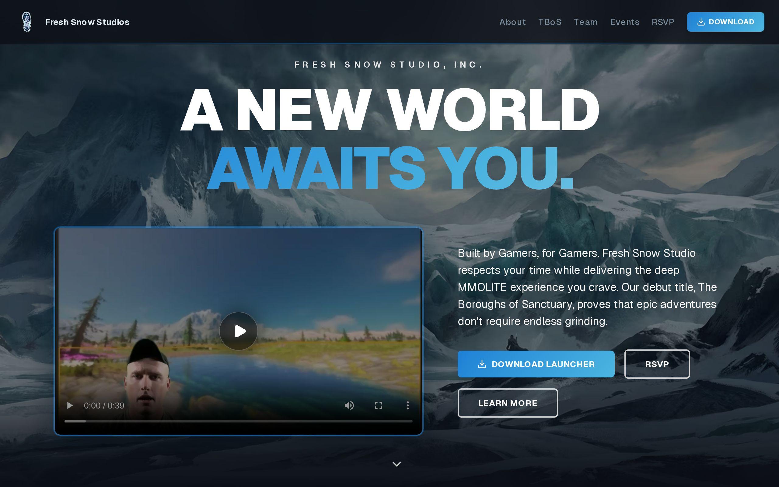
That changes the brief. The site has to look confident and current. And it has to do that while getting out of the way of the actual portfolio. We ran into this directly on the Fresh Snow Studio build, and the tension there is worth walking through, because it's the same tension every creative studio in the Triangle is dealing with, whether they've named it or not.
Why a Creative Studio's Website Is Judged as a Piece of Design Itself
A prospective client visiting a studio's site isn't just checking hours and services. They're asking one question: can this studio be trusted with our brand? The interface answers that question before the portfolio does.
That's a different standard than most local businesses face. A bakery's site sells cookies. A creative studio's site sells judgment. Every choice on the page, spacing, type, how a gallery loads, is evidence.
This is why Fresh Snow Studio's brief started from an unusual place: the site had to demonstrate craft while staying almost invisible. Anything expressive enough to be interesting on its own risked competing with the work it was there to present.
What Happens When the Interface Competes With the Work
Here's the failure mode we see most often in creative studio sites: a homepage that tries too hard. Bold color systems, custom cursors, heavy typography, layered animation. Individually these can be nice touches. Together, they turn the site into the main event.
That's backwards. If a visitor remembers your website's design more than the work inside it, the site did its job too well and your portfolio's job not at all. The interface should read like a gallery wall, not another exhibit competing for the same wall space.
For Fresh Snow Studio, that meant building image-forward layouts where the work occupies the space and the interface recedes. The chrome around the images had to disappear on purpose.
How Much Restraint Is Too Much for a Portfolio Site?
Restraint has a floor. Go too far and a stripped-down site starts to look unfinished rather than confident, which is its own kind of credibility problem for a design studio.
The difference between minimal and underdesigned comes down to intention. A minimal site still has a clear visual system: consistent spacing, deliberate type choices, a grid that holds together across pages. An underdesigned site just looks like nobody got around to it.
On Fresh Snow Studio, the visual system stayed deliberately minimal, but every piece of that system was a choice, not an omission. That's the tell a visitor picks up on even if they can't articulate it. Confident restraint feels calm. Missing design feels cheap.
Why Image-Forward Layouts Outperform Text-Heavy Descriptions
Creative work speaks faster than copy does. A paragraph explaining a brand identity project will never move a visitor the way the identity itself does, shown large, on its own.
That means the instinct to add context, captions, process notes, client blurbs, has to be checked against a simple rule: does this text help someone see the work faster, or does it slow them down before they get there?
The answer for most portfolio pages is to let the image lead. Put the work first, put the framing second, and keep any supporting copy short enough that it doesn't become a wall a visitor has to read through before they get to see anything.
How Page Speed Becomes a Design Decision When Every Image Is Large
Every choice above assumes the images actually load fast enough for a visitor to see them. That's not a technical footnote for a portfolio site. It's core to whether the design decisions above even matter.
A studio's assets are big by nature. High-resolution photography, video stills, layered design comps. A gallery built without real attention to image handling will look great on the designer's machine and load slowly on everyone else's, right at the moment a first impression is being formed.
On Fresh Snow Studio, loading and image handling were tuned specifically so large creative assets stay fast. That's not a separate workstream from the visual design. It's part of it. A beautiful gallery that takes eight seconds to appear has already lost the visitor who was going to be impressed by it.
If you want a read on where your current site stands, run it through our speed test and see what's actually loading slow.
What Role Do Transitions and Motion Play in Signaling Craft?
A static grid of thumbnails can show work, but it can't show craft the way movement can. The way a page responds when a visitor moves between pieces is itself a small demonstration of design sense.
This is where motion earns its place on a portfolio site, but only in a specific role. It should live in the transition, not the content. The moment a visitor scrolls, clicks into a project, or moves from one image to the next is where smooth motion communicates that a studio sweats details. The image itself should stay still and let the visitor look at it.
Fresh Snow Studio used smooth transitions for exactly this purpose, carrying a sense of craft that a static grid couldn't manage on its own. The motion supports the work. It never performs instead of it.
How Should a Studio Balance Showing Range With Staying Focused?
Every studio wants to show it can do more than one thing. That instinct, taken too far, produces a portfolio page that reads like an inventory rather than a body of work.
Range and focus aren't opposites, but they pull in different directions on a page. The fix isn't picking one. It's sequencing. Lead with the strongest, most representative pieces. Let range show up as variety within a tight, curated set, rather than as a long scroll of every project a studio has ever touched.
A prospective client is trying to picture their own project sitting among yours. That's easier to do with ten well-chosen pieces than with forty. Quality of selection is itself a design decision, and it's one visitors register even when they don't consciously notice it.
What Does a Clear Path to Contact Look Like on a Portfolio Site?
None of the restraint above should extend to making it hard to reach the studio. A visitor who's just spent two minutes impressed by your work should never have to hunt for how to start a conversation.
That doesn't mean loud buttons everywhere. It means a contact path that's obvious without being aggressive: present at the natural end of a scroll, present in the navigation, and never buried behind a project detail page with no way back out. The same minimalism that serves the gallery should make the next step feel equally clear, not competing, just present when it's needed.
Where This Leaves Your Studio's Site
If your current site is fighting your own work for attention, that's fixable, and it's usually a smaller job than a full rebuild. Start by looking at your homepage the way a prospective client would: does the interface disappear, or does it perform? We handle this kind of build through Custom Web Development, and it often pairs with a look at brand development if the visual system underneath needs work too.
The next step is simple. Get a free quote and tell us what your portfolio needs to do that it isn't doing yet.