
A campaign website has one job a corporate site never has to worry about: it has an expiration date. Election day doesn't move because the homepage isn't ready. That single fact should shape every decision you make, from the messaging to the build timeline.
Most campaign sites get treated like brochures. A photo of the candidate, a bio, a list of positions, a donate button somewhere near the top. That's not wrong, exactly. It's just not enough. A campaign site is a conversion funnel. Its purpose isn't to inform, it's to turn a stranger into a volunteer or a donor before the clock runs out.
That job gets harder, not easier, the further down the ballot you go.
Why a campaign site has to explain the office before it explains the candidate
Everybody has an opinion about the presidential race. Almost nobody can tell you what a Clerk of Court does.
That's the problem a down-ballot campaign site has to solve first. If a voter doesn't understand the office, they can't evaluate whether the candidate is right for it. You can write the most compelling bio in North Carolina, and it will fall flat if the reader is silently wondering what they're even electing this person to do.
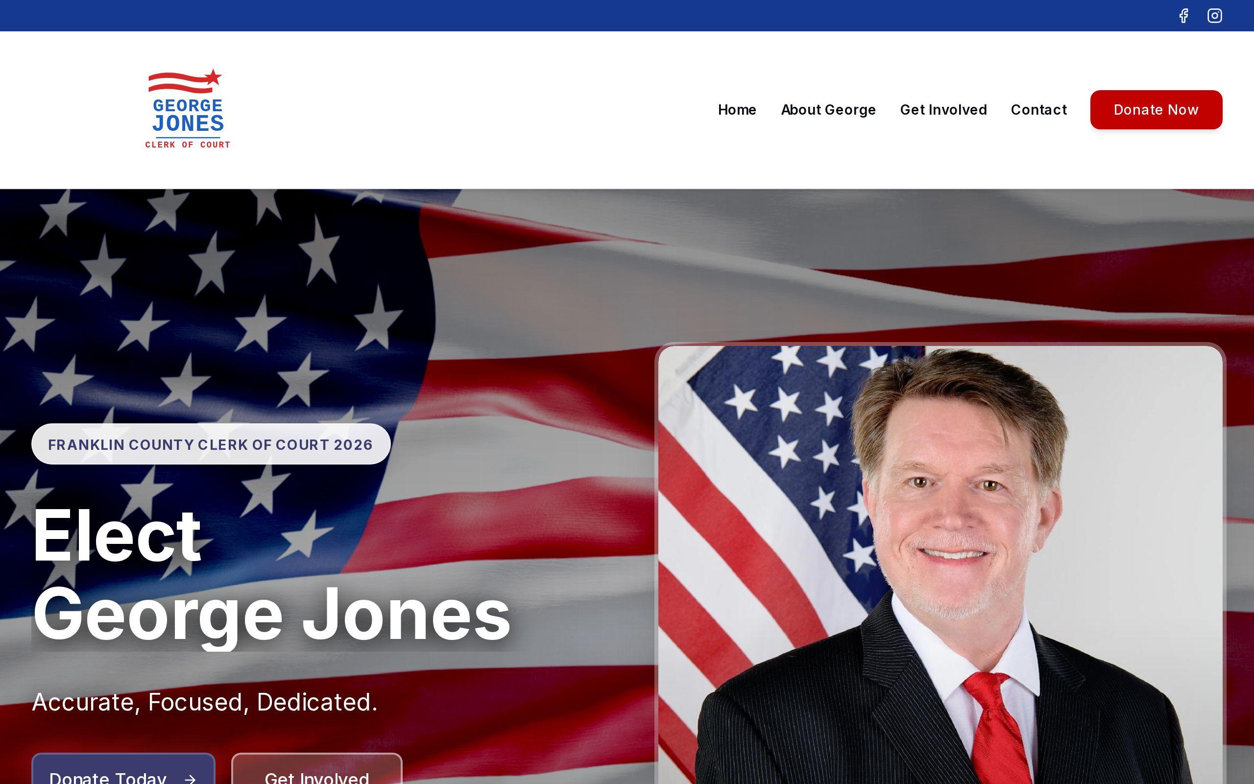
This is the challenge we took on with the George Jones for Clerk of Court campaign site. Clerk of Court is exactly this kind of office: important, procedural, and almost invisible to most voters until they need it. The site had to do real work explaining the role itself before it could make the case for the candidate.
For a race like this, skipping the "what is this office" step isn't a shortcut. It's a tax on every other page. Every argument you make about qualifications lands softer because the reader doesn't have the context to weigh it.
Designing for authority and trust in a judicial-adjacent race
Judicial-adjacent races don't get won on charisma. They get won on competence, or at least the credible appearance of it.
That changes the design brief. A campaign for a legislative seat can lean on energy, personality, a big rally photo. A campaign for an office tied to the courts needs to look like it belongs in a courthouse. Clean layout. Confident typography. No gimmicks. The visual language has to say "qualified" before the copy ever gets the chance to say it.
For the George Jones campaign, we designed authority-forward from the start, because a judicial-adjacent office is won on perceived competence and trust. That meant restraint in the visual choices and precision in the messaging. We wrote and structured the content so voters could understand the role clearly, in plain language, before being asked to back a candidate for it.
This is the part campaigns underestimate. Trust isn't built with a slogan. It's built with clarity. A site that explains itself plainly, without jargon or filler, reads as more credible than one dressed up with buzzy language and stock imagery. For an office tied to the integrity of the court system, that credibility is the entire pitch.
Turning visitors into volunteers and donors, not just readers
Here's the uncomfortable truth about most campaign traffic: a visitor who reads your bio and leaves has cost you an opportunity, not gained you a supporter.
A campaign site has to ask for something. Not once, buried in a footer, but consistently, in a way that matches the reader's level of interest. Someone landing on the homepage from a shared link is a different prospect than someone who just read the full platform page. The calls to action should reflect that.
A few principles worth building around:
- Put the ask above the fold. Volunteer and donate options shouldn't require scrolling to find.
- Make volunteering as easy as donating. Campaigns often treat the donate button as the only real conversion. Volunteers knock doors, make calls, and talk to neighbors. That's worth as much real estate as the money ask.
- Repeat the ask at the end of every page. Someone who finishes the platform page is primed to act. Don't make them hunt for how.
- Keep the forms short. Every extra field is a reason to abandon.
This is grassroots math. A campaign, especially a down-ballot one, isn't outspending anyone into a win. It's out-organizing them. The website is the recruiting tool for that organization, and it should be built like one.
What the George Jones for Clerk of Court site got right
The George Jones campaign site had three jobs happening at once: establish that the candidate was qualified for a role most voters couldn't describe, state the platform plainly, and convert supporters into volunteers and donors. All three had to work simultaneously, because there was no time to sequence them across separate phases of the campaign.
What we built reflected that:
- An authority-forward design suited to a judicial-adjacent office
- Messaging structured so the role comes before the ask
- Prominent, repeated calls to action for volunteering and support
- A build delivered against a fixed election deadline
None of these pieces work in isolation. The authority-first design earns the trust that makes the volunteer ask credible. The plain-language explanation of the office gives the platform section something to stand on. The calls to action turn that trust into people showing up. It's one system, not four separate tactics bolted together.
If you want to see how those pieces come together on a live site, the case study walks through the build, and the site itself is worth a look for anyone planning a similar race.
Building against a deadline that cannot slip
Every web project has a timeline. Campaign websites have a deadline that doesn't negotiate. Election day arrives whether the site is ready or not, and a late launch isn't a delayed launch. It's a failed one.
That reality has to shape how the build gets planned from day one. There's no room for the scope creep or the "we'll get to it after launch" thinking that other projects can absorb. Messaging, design, and development have to move together, because there's no slack in the schedule to fix a sequencing mistake discovered in week four.
It also means the technical foundation has to be solid enough not to need firefighting during the final stretch, when the campaign's attention is elsewhere. A site that's slow, confusing, or breaks on mobile during the last two weeks before an election doesn't get a second chance to make a first impression. If you're not sure where your current site stands, our speed test will show you in a couple of minutes.
If you're running for office, down-ballot or otherwise, and your campaign is still deciding what the website needs to do, start with the job, not the design. Explain the office. Build trust fast. Ask for help clearly and often. And build it against your real deadline, not an ideal one.
Next step: if your election date is set, work backward from it now. Figure out how many weeks of runway you actually have for design, development, and messaging, and start the build with that number, not with a wish list. If you want a second set of eyes on the plan, get started with a conversation about your timeline.