
Most campaign websites are built for offices voters already understand. Mayor. Governor. Sheriff. You know roughly what the job is, so the site just has to make the case for the person.
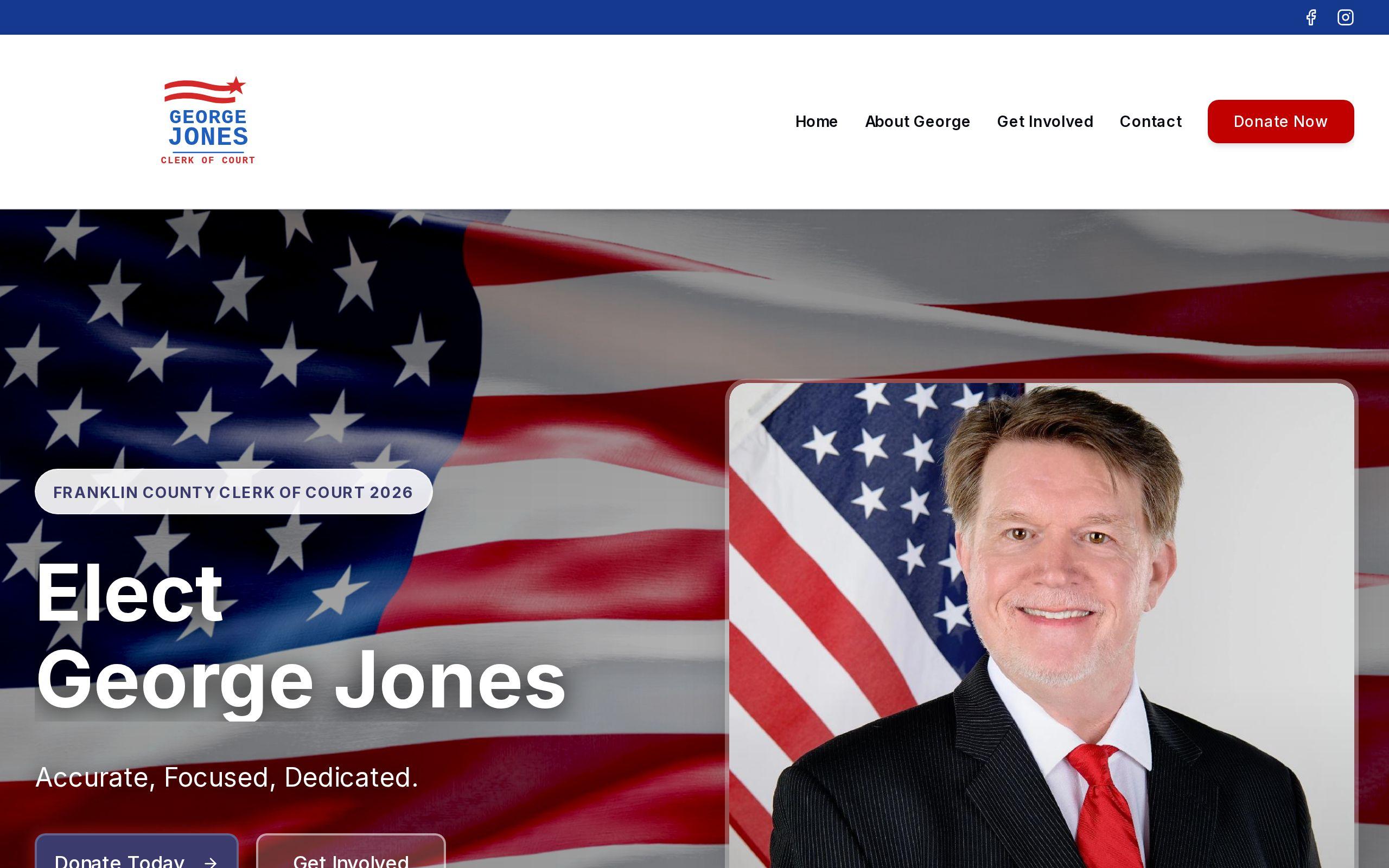
Clerk of Court is not that kind of race. It's a real office with real power over how the court system touches people's lives, and most voters couldn't tell you what it does. That's the problem we were hired to solve when we built the website for George Jones for Clerk of Court.
What does a down-ballot campaign website actually have to accomplish?
A campaign site has three jobs, and it has to do all three before Election Day or it hasn't done its job at all.
First, establish that the candidate is qualified for a role most visitors cannot describe. Second, state the platform plainly enough that a busy voter gets it in one pass. Third, convert supporters into volunteers and donors, because a campaign that only informs people without mobilizing them is a campaign that loses.
Most business websites can afford to build trust slowly, over multiple visits. A campaign site doesn't get that luxury. A voter might land on it once, days before an election, and decide right there whether this candidate has their support.
Why did the site have to explain the job before making the case for the candidate?
Clerk of Court is down-ballot, which means it sits below the offices that get news coverage and debate stages. Voters don't arrive with context. If the site opens with "vote for George" before answering "what does a clerk of court even do," it's asking for a decision before it's earned the right to.
So the messaging structure had to teach first. We wrote and structured the content so a visitor understands the role, what it touches, why it matters, before being asked to back anyone for it. Skip that step and the strongest platform in the race reads as noise, because the reader has no frame to put it in.
This is the part a lot of local campaign sites get backwards. They lead with biography and endorsements because that's what statewide races do. Down-ballot races need to lead with context.
How do you design a site to read as authoritative on a judicial-adjacent race?
Clerk of Court sits next to the judicial system, and judicial-adjacent races are won on perceived competence, not charisma. A site that looks like a typical political landing page, bold colors, big slogans, stock photo waves, works against that goal. It reads as marketing when the moment calls for credibility.
We designed the site to be authority-forward. That means restrained visual choices, clear typography, and a layout that feels closer to an institution than a rally. The design decisions here weren't stylistic preferences. They were arguments. Every page had to say "this person understands how serious this office is" before the copy ever made the case directly.
That's a different design brief than most campaign work, and it's one we think more local candidates in judicial-adjacent races should be asking for.
What messaging structure builds trust with undecided voters?
Undecided voters are not persuaded by adjectives. They're persuaded by a clear sequence: here's the office, here's what's broken or at stake, here's the platform, here's the person, here's what to do next.
We built the messaging in that order deliberately. Explain the role. State the platform. Introduce the candidate against that platform, not ahead of it. Close with a clear action. Each section earns the next one instead of assuming the reader is already sold.
This is also why campaign messaging is its own service line for us, alongside design and development. A beautiful site with muddled messaging still loses undecided voters, because they came looking for clarity and left with a vibe instead.
Why did volunteer and donation calls to action need to be prominent?
A campaign website that only informs is a website that wastes its own traffic. Every visitor who reads about the platform and leaves without volunteering or donating is a missed conversion, and campaigns don't get a second budget to fix that later.
So the calls to action for volunteering and support were built prominent, not tucked into a footer or a separate page three clicks deep. Grassroots campaigns run on people showing up and people giving what they can, and the site had to make both of those next steps obvious the moment someone was ready.
This is the same logic that applies to any conversion-focused site, campaign or otherwise: the ask has to be as easy to find as the argument that leads to it. If you want a sense of how your own site's structure holds up, our speed test is a fast way to see where friction is hiding.
How do you deliver a campaign site against a fixed election deadline?
An election date does not move. There is no "we'll ship it next sprint" in campaign work. A late launch is a failed launch, full stop, because every day the site isn't live is a day of lost volunteer sign-ups and lost donations that can't be recovered later.
That reality shaped how we approached the build from the start. Scope, review cycles, and content decisions all had to fit inside a calendar that was fixed before we wrote a line of code. Custom development on a hard deadline means making sure the things that take the longest to get right, messaging and structure, get decided early, while the things that can move fast, visual polish, get finished last.
We handled the full build under Custom Web Development, and the deadline was as much a design constraint as anything visual.
What would have gone wrong with a generic campaign template?
A template can hold a bio, a platform list, and a donate button. What it can't hold is the specific explanation a down-ballot, judicial-adjacent race needs before any of that content lands.
Drop this campaign into a generic template and the site skips straight to "vote for George," because that's the structure the template assumes. Undecided voters bounce, because nobody told them what they're voting for. The authority-forward design gets replaced by whatever the template ships with, which undercuts the exact trust the race depended on.
Templates solve for speed. This brief needed speed and a structure built around one specific, unfamiliar office. Those aren't the same problem, and a generic template only solves one of them.
What can other local candidates learn from this build?
If you're running for a down-ballot office, your website has more work to do than the candidate two rungs up the ballot from you. Don't assume voters know the job. Explain it first, plainly, before you ask them to choose a side.
Match your design to how the office is perceived. A judicial-adjacent race needs a site that reads as competent and careful, not flashy. And put your volunteer and donation asks where people can't miss them, because a campaign site that only informs is leaving support on the table.
You can see the full site and the thinking behind it on the George Jones for Clerk of Court case study page.
If you're planning a run for a local office and your election date is already on the calendar, the time to start your site is now, not after the filing deadline passes. Get started with us while there's still enough runway to do it right.