
Why Healthcare Websites Carry a Higher Burden of Proof
Most business websites ask a visitor to trust a product or a price. A healthcare website asks something bigger: trust an organization with your health.
That changes everything about how the site has to work. A confusing menu on a restaurant site costs you a reservation. A confusing menu on a healthcare site costs you a patient's confidence, and confidence, once lost, is hard to win back on the same visit.
Anything that reads as unprofessional or unclear does double damage. It does not just fail to convert. It actively signals that the organization behind it might not be as careful with a patient as it needs to be. That is the burden of proof healthcare sites carry, and it is why CS Medical needed a different approach than a typical business rebuild.
What Was the Brief Behind the CS Medical Website?
CS Medical LLC came to Forzur with a website that needed to do two things at once: read as trustworthy to someone making a health decision, and explain its services in a way a non-clinical visitor could actually understand.
Those two goals pull against each other more often than people expect. A site that leans too hard into clinical polish can end up sounding like it was written for other clinicians, not for patients. A site that oversimplifies can read as unserious. The brief was to hold both: professional enough to build trust, plain enough to be understood.
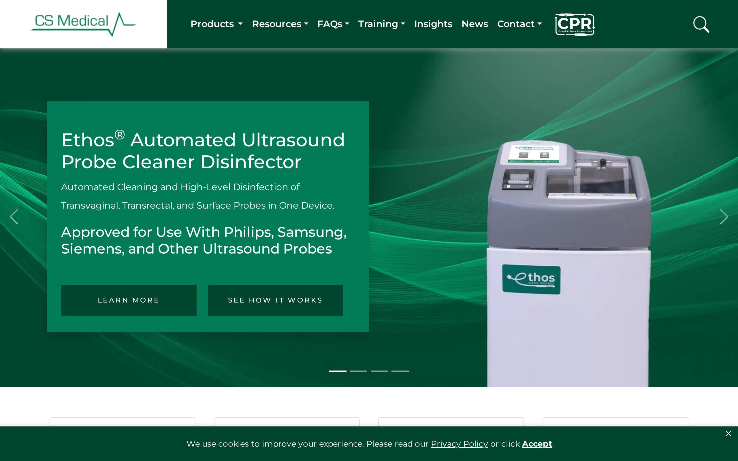
The full breakdown of what was built lives on the CS Medical case study page. Here is how the pieces came together.
How Do You Design a Site to Read as a Clinical Trust Signal?
Before a visitor reads a word of copy, they have already formed an impression. Layout, spacing, typography, and how the page loads all register before content does.
For CS Medical, the design was built credibility-first. Every page treats professional presentation as a clinical trust signal in its own right, the same way a clean, well-run waiting room tells a patient something before a receptionist says a word.
That meant discipline in a few specific places:
- Consistent visual hierarchy, so nothing on the page feels improvised
- Clean, unhurried layouts that give information room to breathe
- A design language that stays professional without tipping into cold or clinical
None of this is decoration. On a healthcare site, it is the first argument the organization makes for why a visitor should keep reading instead of hitting back.
Why Plain Language Beats Clinical Terminology on a Patient-Facing Site
Here is the part that trips up a lot of healthcare sites: the people who know the services best are usually the ones writing about them, and they default to the language they use with colleagues.
That is a problem, because clinical terminology loses exactly the patients the site is meant to convert. A visitor who does not recognize a term will not look it up. They will assume the service is not for them and leave.
CS Medical's services were broken down in plain language so a patient can identify what they need without already knowing the clinical vocabulary. The goal was not to dumb anything down. It was to describe services the way a patient actually thinks about their own problem, then let the clinical precision live underneath that, not in front of it.
How Was the Contact Flow Built for Patients Instead of Paperwork?
A lot of healthcare sites default to long, form-heavy contact pages, because that is what the intake process looks like internally. Name, date of birth, insurance provider, reason for visit, referring physician, all before a patient has even spoken to anyone.
That default makes sense for the practice. It makes much less sense for a visitor who is still deciding whether to reach out at all.
CS Medical's contact flow was calibrated for patients, not paperwork. The intake detail still gets collected, but not as the price of admission for making first contact. A patient who is nervous or pressed for time should not have to complete a form built for administrative convenience before they can ask a question or request an appointment.
How Does the Site Make Booking the Obvious Next Step From Any Page?
A patient does not always land on the homepage. They might arrive from a search for one specific service, or a page about a specific condition, and they are not going to go hunting for a "Contact" link buried in a menu.
The site was structured so that booking an appointment is the clear next step from any page, not just the ones built for conversion. Wherever a visitor lands, the path to booking is close by and unambiguous.
This matters more in healthcare than almost anywhere else. A visitor who has to search for how to take action has time to reconsider, and reconsidering, for a health decision, often means closing the tab.
What Results Came From Rebuilding CS Medical's Website This Way?
The rebuild focused on three outcomes: a site that reads as credible from the first impression, services a patient can understand without clinical training, and a booking path that does not make patients work to find it.
Those three things are not separate features bolted onto each other. They reinforce one another. A visitor who trusts the site is more willing to read the plain-language service descriptions. A visitor who understands what a service is for is more likely to look for how to book it. And a visitor who finds booking easy is more likely to follow through instead of leaving to "think about it."
Full details on the approach and the finished site are on the CS Medical case study page, and the live site is worth a look in its own right for anyone weighing a similar rebuild.
What Can Other Healthcare Practices Take From This Case Study?
If your site is written the way your staff talks to each other, it is probably losing patients who do not recognize the vocabulary. If your contact page reads like an intake form, it is probably losing patients before they ever reach a human. And if booking is not visible from wherever a visitor lands, you are relying on them to go looking for it.
None of that requires guesswork to fix. It requires treating the website the way you would treat a first appointment: professional, plain-spoken, and structured around what the patient actually needs to do next.
Where to Start
If your practice's site reads more like internal documentation than something built for a nervous, time-pressed patient, that is worth fixing before anything else. Run it through our speed test to see how it performs today, then take a look at our web development services or get started with a conversation about what a credibility-first rebuild would look like for your practice.