
What Happens When One Website Has to Sell Four Different Businesses?
Most business websites have one job. Sell the one thing, to the one kind of customer, with the one path to contact. Bhumi & Bloom Co. never had that luxury.
It's a working regenerative farm. It's a floral studio. It's a micro-wedding venue. It's a workshop program. Four different offers, four different customers, one name on the sign. A bride researching venues, a shopper hunting for spray-free flowers, and a hobbyist looking for a weekend workshop are not the same person, and they don't want the same page.
We built the site to hold all four without turning into a crowded list of services that reads like a menu nobody ordered from. That meant rethinking the structure from the ground up, not skinning a template with new photos and calling it done.
This case study walks through what we built for Bhumi & Bloom and why, and what it says about designing for any local business that has outgrown the idea of "one offer, one page."
Why Bhumi & Bloom Needed More Than a Single Services Page
Here's the trap a lot of multi-offer businesses fall into. Every service gets a bullet point on one page, under one headline, competing for the same six seconds of attention. The farm-to-table shopper, the wedding planner, and the workshop-curious neighbor all land on the same wall of text and have to do the sorting themselves.
That's asking the visitor to do the work the website should be doing. And it flattens what makes each offer distinct. A micro-wedding venue and a Saturday flower-arranging workshop don't sell on the same terms. One is a high-stakes, high-trust booking. The other is a low-commitment, spontaneous yes.
Bhumi & Bloom's brief was direct about this: a single generic template would have flattened four businesses into an unfocused list of services. The fix wasn't more copy on one page. It was giving each offer its own room to make its case, on its own terms, without competing for the same real estate.
How the Site Separates the Farm, the Florals, the Venue, and the Workshops
We structured the site around Bhumi & Bloom's four revenue lines, not around a generic "services" template. Each one gets room to sell on its own terms instead of fighting for space on a single crowded page.
That matters because each offer has a different job to do:
- The farm needs to build trust in how the land is worked, since that's the whole reason a customer picks it over a grocery store bouquet.
- The floral studio needs to show range and style so a buyer can picture their own order.
- The micro-wedding venue needs to carry the emotional weight of a once-in-a-lifetime decision.
- The workshop program needs to feel approachable and low-pressure, an easy yes rather than a big commitment.
Giving each of those its own selling room means none of them gets diluted by the others. A couple deciding on a venue isn't scrolling past produce listings to get there, and a shopper looking for flowers isn't wading through wedding packages first.
Why Photography Had to Carry the Brand's Sense of Place
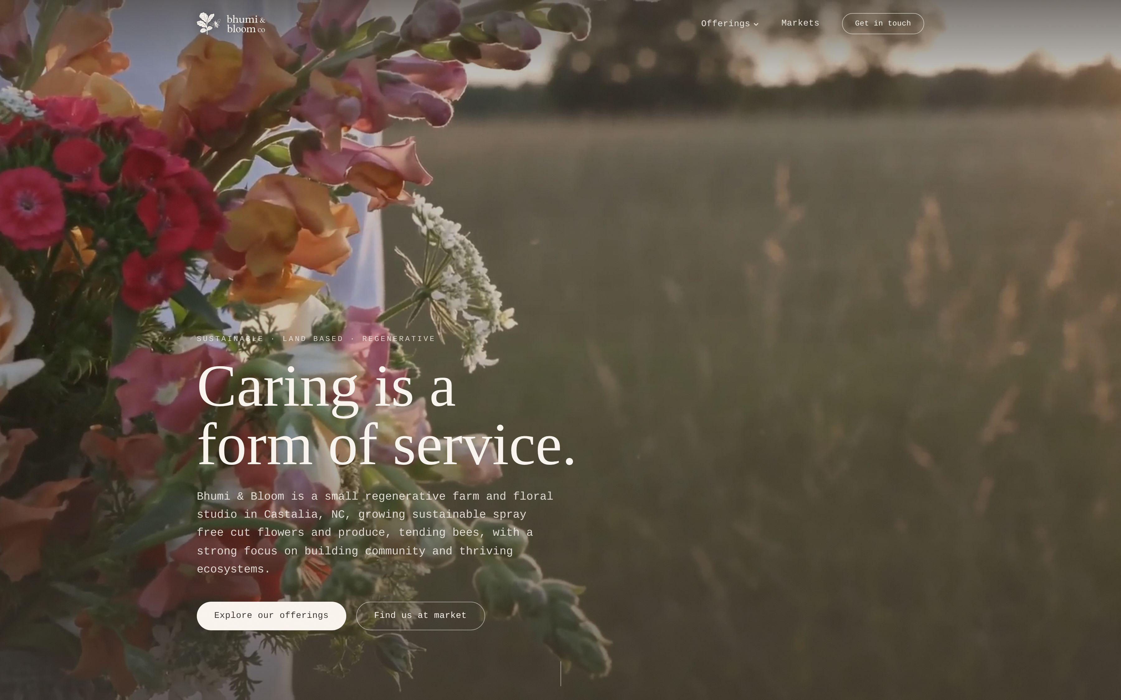
A regenerative farm and floral studio is selling something a stock photo can't fake: a specific piece of land, worked a specific way. That's the whole case for choosing Bhumi & Bloom over a wire-service florist or a generic event venue. You can't write your way to that feeling. You have to show it.
So the site leans on image-forward layouts, built to let photography of the flowers, the produce, and the land do the talking. That's a deliberate design choice, not decoration. Text can describe a working farm. A photograph of the actual rows, the actual blooms, the actual light on the property, does the convincing.
This is also where the four-businesses structure pays off again. Each section can use photography suited to its own mood: the farm section can feel grounded and working, the venue section can feel intimate and golden-hour, the workshop section can feel casual and hands-on. One shared image style across all four would have muddied the distinctions the structure was built to create.
If your own business depends on a sense of place, browse the Bhumi & Bloom case study to see how the layout gives the photography room to work.
How the Copy Hierarchy Puts Regenerative Practices Front and Center
Plenty of farms and florists lead with price, availability, or a generic "family owned since" line. Bhumi & Bloom's actual differentiator is how the farm is run: regenerative, spray-free practices. That's a real reason to choose them over a competitor, but only if a visitor actually sees it.
We wrote and designed the copy hierarchy so those practices read as the headline differentiator, not a footnote buried under delivery logistics or booking details. That's a positioning decision as much as a writing one. It tells the visitor, in the first few lines, what makes this farm different before it tells them anything else.
For a brand built on how something is grown, that hierarchy is the whole pitch. Get it right and the rest of the page just has to support the claim. Get it wrong, bury it under scheduling details, and the visitor never learns the one thing that would have sold them.
This is the kind of work that lives at the intersection of brand development and web design: deciding what gets said first, because what gets said first is what gets remembered.
Why a Micro-Wedding Inquiry Needs a Different Path Than a Workshop Signup
A couple inquiring about a micro-wedding is making a major decision with a long lead time. A workshop signup is closer to an impulse booking. Funnel both through the same contact form and you either overwhelm the workshop visitor with wedding-planning questions, or underwhelm the wedding lead with a form too thin to capture what they actually need to share.
So the site was designed with inquiry paths tuned to each offer. A micro-wedding lead and a workshop booking follow different routes, built for the different pace and stakes of each decision. That's a small structural choice with a real business consequence: leads arrive already sorted, already primed for the right kind of follow-up, instead of landing in one inbox that has to be triaged by hand every time.
For a business running four offers out of one team, that sorting work matters. It's the difference between a founder spending time on the phone re-asking questions a better form would have already answered, and a founder picking up a lead that's already qualified for the right conversation.
What This Case Study Says About Websites for Multi-Offer Local Businesses
Bhumi & Bloom isn't an edge case. Plenty of local businesses in the Triangle run more than one offer under one name: a farm that also hosts events, a studio that also teaches, a shop that also caters. The instinct is to list everything on one page because that's what "we do it all" looks like from the inside.
But a visitor doesn't experience a business from the inside. They land looking for one thing, and if the site makes them dig for it, they leave. The lesson from Bhumi & Bloom is structural: build the site around what the business actually sells, as distinct lines, not around a template that assumes one offer.
That applies whether you're planning a wedding venue website design project or building out a farm's e-commerce presence. The architecture has to match the business, not the other way around.
What Would We Do Differently for a Similar Multi-Business Brand?
Every project like this raises the same question early: how many "front doors" does the site actually need? For Bhumi & Bloom, the answer was four, one per revenue line, each with its own photography mood, copy hierarchy, and inquiry path.
For a different multi-offer brand, the number might be two or six, and the split might run along customer type instead of product line. What stays constant is the principle: identify the distinct businesses hiding inside the one brand name before writing a line of copy or choosing a layout. Skip that step and no amount of good photography or clever copy will save the site from feeling like a list.
If your own business has outgrown a single-page pitch, that's the conversation worth having before the next redesign.
Next Step
If you're running more than one offer under one name, and your current site treats them all the same, start with a quick speed test on your existing site, then talk to us through Get Started about what a structure built around your actual revenue lines would look like.