Most studio sites are built backward. They start with the finished work and wrap a brand around it. That is easy when you have a decade of releases to show.
Old Copperhorn Entertainment had a different problem. We want to walk through it, because it is the clearest example we have of how to structure a studio website for new projects that do not exist yet.
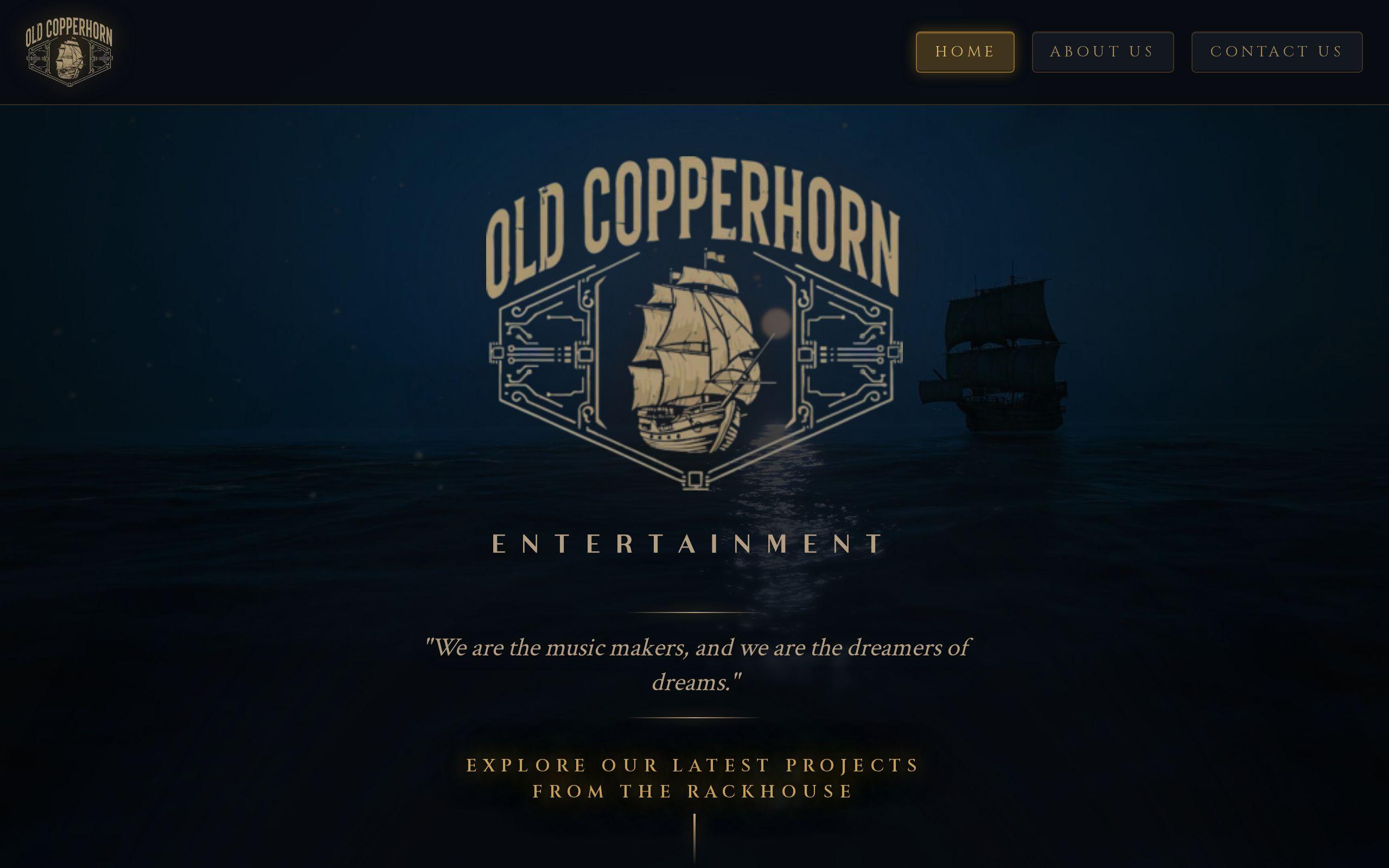
You can see the finished result on the Old Copperhorn case study page.
Why is a studio with unreleased work the hardest site to structure?
Because there is nothing to point at.
Old Copperhorn develops original franchise IP. It is selling potential, not a finished catalogue. A normal portfolio grid would sit half empty, and an empty grid says "we are small" louder than any headline can say otherwise.
The opposite mistake is just as bad. Fill the space with enthusiastic previews and the site turns into a fan page for work that has not shipped.
So the structure had to do two things at once:
- Carry weight without a back catalogue.
- Make room for work that is still coming.
Every decision after that flowed from those two constraints.
Who is the site actually talking to: partners or fans?
Both. At the same time.
The brief named two audiences. Industry partners are evaluating whether the studio is credible. Future fans are deciding whether the worlds are worth caring about.
Those readers want different things. A partner wants to see a studio with a clear identity and a plan. A fan wants to feel something.
Most sites pick one and quietly fail the other. We went the other way. The goal was a structure that works for industry partners and prospective audiences without diluting either.
The trick is that both audiences respond to the same thing: a studio that knows exactly what it is. Confidence reads as credibility to a partner and as mystery to a fan. One voice can serve both if it is disciplined.
How does leading with the brand and worlds sell atmosphere as the product?
When you have no finished titles, the world is the asset.
We led with the brand and the worlds themselves, and treated atmosphere as the product being sold. The first thing a visitor gets is the feel of the studio, not a list of deliverables.
That is a real position. It says the point of view comes before the product, and the products will follow from it.
If you run a creative business with a thin portfolio, this is worth stealing. Do not apologize for what you have not made yet. Show how you think, how things look and what kind of stories you tell. Our brand development work exists for exactly this reason: when the brand is strong, the site has something real to stand on.
What does designing for streaming, film and comics change about the page structure?
It changes the question you ask of every page.
Streaming, film and comics are different media with different audiences and different timelines. A site built around a single format would need surgery the first time the studio moved into another one.
So we designed for expansion across all three from the start. That meant asking of each section: does this still make sense when a film sits next to a comic?
A few consequences follow from that:
- Navigation by world, not by format. A property can live in more than one medium, so the format cannot be the only way in.
- Neutral containers. Page layouts that suit a series, a feature or a comic run without favoring any of them.
- No dead ends. Nothing is labeled "coming soon" in a way that ages badly.
None of this is flashy. It is the plumbing, and plumbing is what decides whether a site survives year two.
How do new properties slot in without forcing a rebuild?
By treating a property as a repeatable unit.
The phrase in the brief was that new properties should "slot in rather than forcing a rebuild." That is a structural promise, and it only holds if the pieces are designed to repeat.
Think of it as a template for a world. Each property gets the same kinds of space for the same kinds of content, so a new one arrives as a new set of entries, not a new design. The studio adds. The site absorbs.
This is where custom development earns its keep. An off-the-shelf theme assumes you already know what you will publish. A purpose-built structure lets a studio with an unwritten future keep writing it.
The test we use is simple. Picture the studio announcing a new property next spring. Does anyone need to call a designer? If the answer is yes, the structure failed.
How does the site keep from reading as a fan page?
By staying in the studio's voice, not the audience's.
A fan page speaks from the outside, with excitement. A studio speaks from the inside, with intent. That difference is mostly tone and framing, and it is easy to get wrong.
Three habits keep the line clear:
- Lead with the studio, then the work. The properties are evidence of a point of view, not the whole story.
- Show restraint. Hold back on countdowns, teasers and hype for things that have not shipped.
- Write for someone deciding, not someone waiting. A partner and a fan are both making a call. Help them make it.
When unreleased work is framed as part of a larger creative vision, it looks like a pipeline. When it is framed as a thing to be excited about, it looks like a wish.
What visual choices make the studio read as having a point of view?
Distinctiveness, applied consistently.
We built a visual language distinctive enough that the studio reads as having a point of view. The aim was that a visitor could tell this was Old Copperhorn even with the logo covered.
That matters more than it sounds. Without a long list of credits, the look and feel does the credibility work. It tells a partner that someone made deliberate choices, and it tells a fan that the worlds have a texture worth exploring.
A strong visual system also makes the expansion plan safer. New properties inherit the studio's look, so the whole site stays coherent as it grows. Consistency is what lets a young studio look established.
What can any growing creative business borrow from this structure?
More than you would expect, even if you have never pitched a franchise.
Here is the short version:
- Sell what you have. If that is atmosphere and a clear point of view, lead with it.
- Decide your audiences up front. Then write one voice that can serve them all.
- Structure for the next thing, not the last thing. Ask whether a new offering slots in or forces a rebuild.
- Use repeatable units. A template for a project, a service or a world beats a bespoke page every time.
- Make the look do the talking. Distinctive design is cheaper than a long résumé.
Studios, agencies and production companies around Raleigh and the Triangle are often in the same spot: growing faster than their site. If that sounds familiar, our page on creative agency website design covers how we approach it.
Your next step
Open your site and pick one thing you plan to launch in the next year. Count the pages that would need to change to fit it.
If the answer is more than the one new page, talk to us at /get-started and we will look at the structure with you.