
If you want to know how to make your website mobile friendly for local customers, start with a simple picture. Someone is standing somewhere, phone in hand, and they need what you sell. They will give your site a few seconds.
This is a guide you can work through this week. Grab your phone.
Why do local customers judge your site on a phone first?
Because the phone is where the need shows up.
Think about who searches for a local business. A person in a garage full of old furniture. A couple walking downtown deciding where to eat. A homeowner with water on the floor. None of them are at a desk.
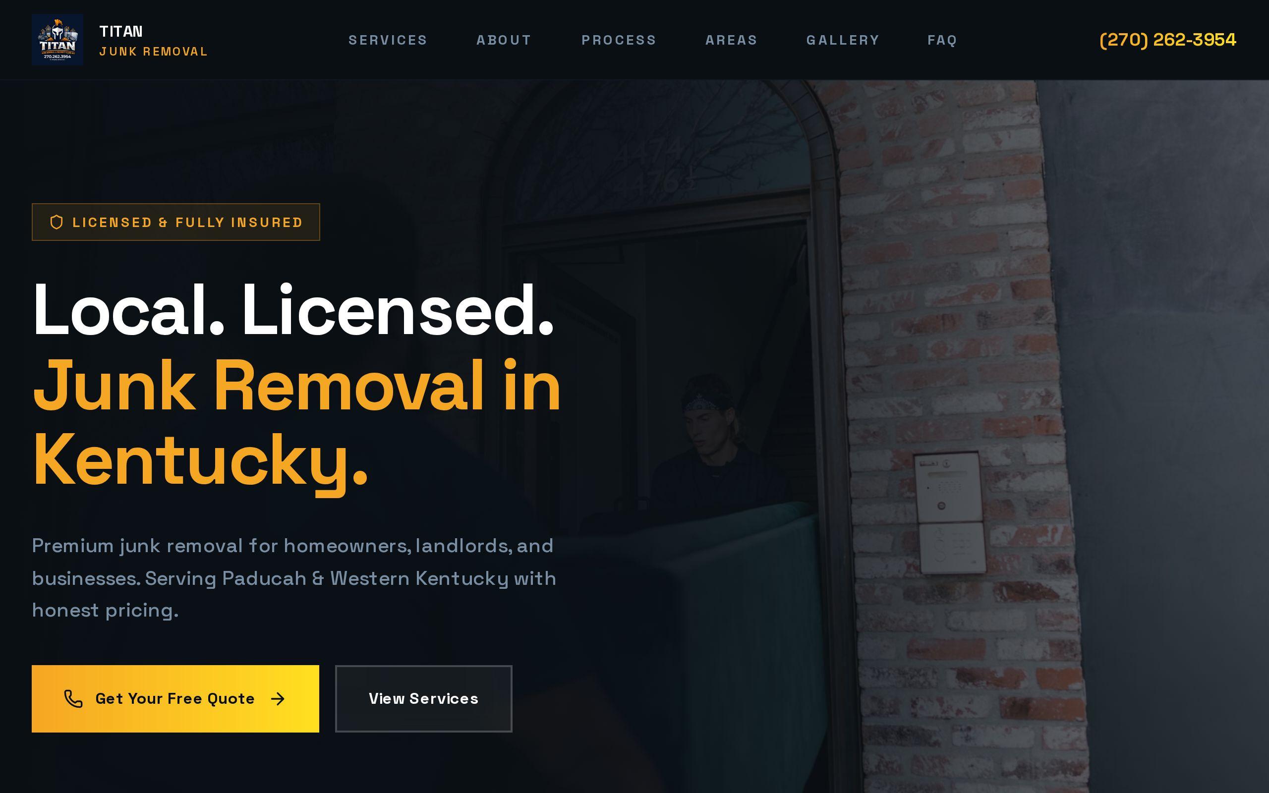
Our work for Titan Junk Removal started from exactly this. Junk removal is an urgent, phone-first purchase, and the person searching is likely to call the first company that makes calling easy. A desktop-shaped site with a contact form is the wrong tool for that moment.
So treat the phone as the real site. The desktop version is the adaptation.
What does a visitor need within one tap?
Three things cover most local businesses: how to reach you, when you are open, and where you are.
For Las Mas Mexican Kitchen & Bar in Wake Forest, we put the menu, hours and location within one tap of every screen. A hungry person on a sidewalk came for those three things. Anything slower and they open a delivery app instead.
Do the same exercise for your business. Write down the top three things a first-time visitor wants. Then check each one:
- Can they reach it from the home page without scrolling?
- Can they reach it from any inner page?
- Does it take one tap, or a hunt?
If the answer is a hunt, that is your first fix.
How do you make a phone number tappable and obvious?
Make it a button, and make it the loudest thing on the screen.
Titan's site makes click-to-call the dominant action throughout. Not one call to action among six. The dominant one. The look is bold gold on dark, which stays legible and distinctive in crowded search results, and the call button never has to compete for attention.
Here is the checklist:
- The number is a real phone link, so one tap starts the call.
- It sits in the header, visible without scrolling.
- It stays reachable as the visitor scrolls, on every page.
- The button is big enough for a thumb, with space around it.
- It says what happens, such as "Call now," not just the digits.
Not every business should lead with a call. A restaurant leads with the menu. But if calls are how you earn money, say so with the design.
How do you test your site the way a customer would?
Like a stranger, on a real phone, with a stopwatch.
Do not test on your office wifi with your own phone in a calm room. Turn wifi off. Use cell data. Open a private browser tab so you are not logged in to anything. Then pick one task.
Try these:
- Find the number and call it.
- Find today's hours.
- Get directions to the door.
- Request a quote or book a time.
Time each one. If you cannot finish in a few seconds, a customer will not either. Better yet, hand the phone to someone who has never seen your site and watch without helping. You will wince. That is useful.
Do it on an older phone too, if you have one.
How do you keep menus and hours readable on a small screen?
Cut anything that makes people pinch and zoom.
Las Mas needed the menu, hours and address in seconds. That tells you the standard. A visitor should read them without zooming, without a download, and without opening a file.
Watch for these common failures:
- A menu that is a PDF scaled down to a postage stamp.
- Hours in a small image or tucked into the footer.
- An address that is plain text, not a link that opens a map.
- Text so small that it needs two fingers.
- Hours that say "see below" and then are not below.
Write the menu as real text, in short sections. Put hours as a simple list, with today easy to spot. Make the address a tap that opens directions. If you want to see this thinking applied to a whole category, our restaurant website design page covers it, and the Las Mas case study shows the result.
How short should a phone form be?
Shorter than you think. Then shorter again.
Typing on glass is slow and annoying. Every field you add is a reason to quit. Ask yourself what you truly need to reply to this person. For most local service businesses, that is a name, a phone number, and a line about what they need.
Everything else can wait for the conversation.
A few habits help:
- Use the right keyboard for each field, so the number pad appears for a phone number.
- Label every field clearly, above the box, not inside it.
- Make the submit button big and say what it does.
- Offer a call button right next to the form, for people who would rather skip typing.
That last one matters. Titan was built around the idea that a form is the backup plan, and calling is the plan.
What slows a phone page down?
Mostly images, and mostly ones nobody needed at that size.
A photo that looks lovely on a big monitor can be many times heavier than a phone needs. Add a chat widget, a few tracking scripts, a slider on the home page, and a font or two, and the page crawls on cell data.
You do not need to guess. Run your address through our free speed test and look at the phone results, not the desktop ones.
Then work through the usual suspects:
- Oversized photos on the home page.
- Auto-playing video at the top.
- Sliders and carousels nobody swipes.
- Scripts added over the years that nobody remembers adding.
- Pop-ups that cover the call button.
Food photography does the selling at Las Mas, so images stay. The point is to send each phone the right size, not to strip your site bare.
What is a sensible order for fixing it all?
Fix what costs you calls first. Polish later.
Here is the order we would take it in:
- Tap to call. Make the number a button, in the header, on every page.
- Hours and address. Real text, one tap from anywhere, with a map link.
- Menus and key pages. Readable without zooming.
- The form. Cut it to the fewest fields you can live with.
- Speed. Shrink images, drop dead scripts, retest.
Steps one and two are often an afternoon. Most of the rest fits in a week.
If you find the problems run deeper than a few edits, such as a layout that was never built for a phone, that is a rebuild question. Our custom web development work starts with the phone screen for exactly that reason.
Your next step this week
Tonight, take your phone, turn off wifi, and try to call your own business from your own site. Time it.
If it takes more than a few seconds, you have your first fix. Write it down, make it tomorrow, and run the same test again.