
You probably look at your website on a laptop. Your customers probably don't.
They are standing in a driveway, sitting in a parked car on Fayetteville Street, or lying on a couch, with one thumb free. That is the site you need to build. This guide is an audit you can finish this week, with no developer required for the first half.
Is your website actually usable on a phone?
Here is the test. A page can load on a phone and still be unusable on one.
Most sites called "mobile-friendly" are desktop pages that shrink to fit. The columns stack, the text gets small, and everything technically appears. Nothing was decided with a phone in mind, so the visitor pinches, zooms and hunts.
Mobile-friendly means the opposite order. You start with the phone screen, decide what a visitor needs there, and let the desktop version be the roomier cousin.
Ask one question of your own site: can a stranger do the main thing you want from them, one-handed, in under a minute? If you hesitate, keep reading.
How do you test your site the way a customer would?
Put the laptop away. Pick up your phone, switch off Wi-Fi so you are on cellular, and open your site cold from a search result.
Then try to do five things:
- Call the business.
- Find today's hours.
- Find the address and get directions.
- Find your most popular service or product.
- Start a quote, booking or order.
Time yourself. Better, hand the phone to a friend or a family member who has never seen the site, and keep quiet. Watch where their thumb goes and where they frown.
Write down every spot where they hesitated. That list is your audit. Everything below is how to fix what is on it.
Which one action should the phone screen make easiest?
Every business has one move that matters most on a phone. Pick it and commit.
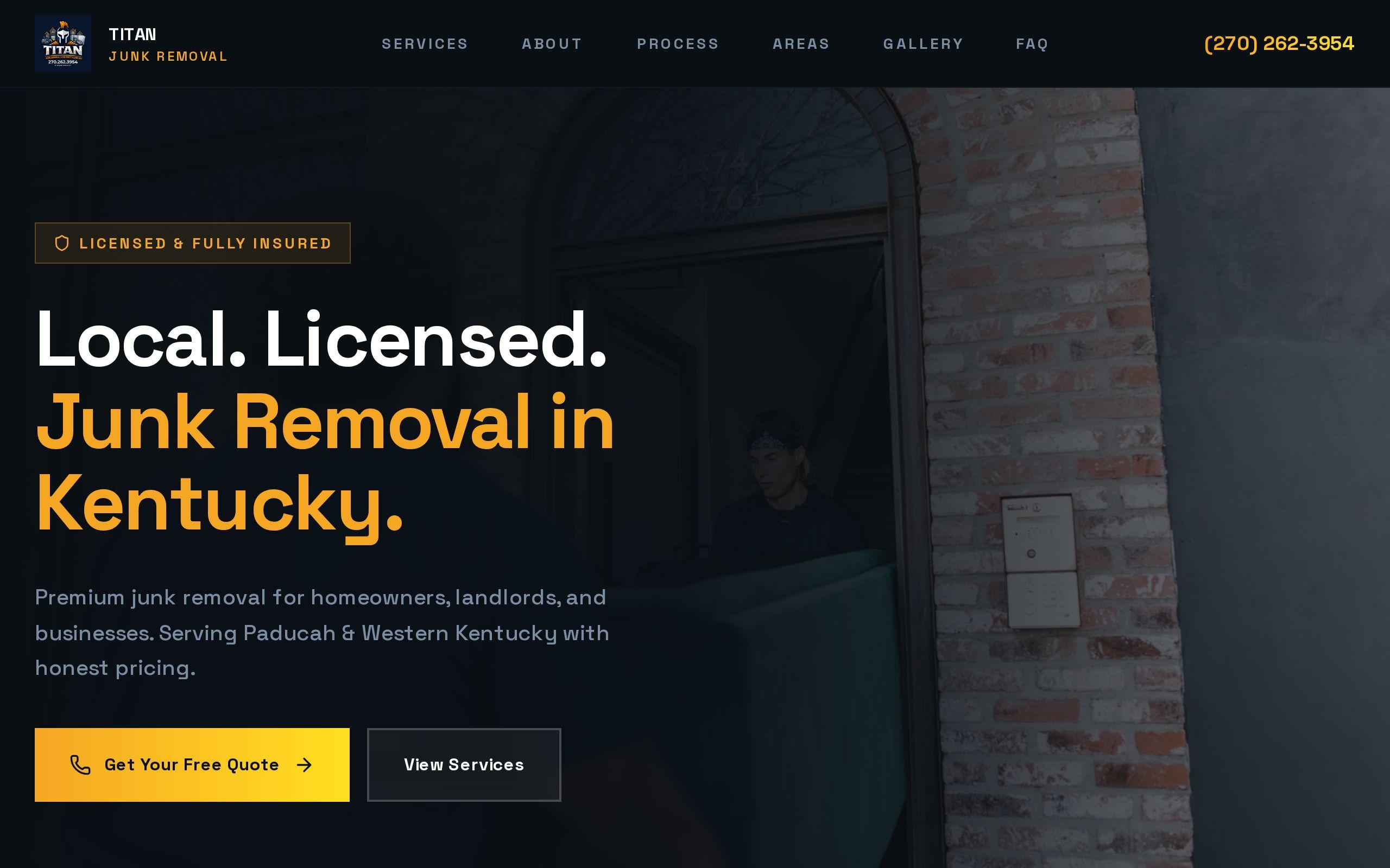
Titan Junk Removal is the clearest example we have. Junk removal is an urgent purchase. Someone standing in a garage full of things they want gone is searching on a phone and will call the first company that makes calling easy. So that site was designed mobile-first, with the phone screen as the primary layout, and click-to-call is the dominant action throughout. You can read how it came together in the Titan Junk Removal case study.
Your primary action might be different. A call. A reservation. A directions tap. A short quote request.
Choose one. If you pick three, you have picked none, and the visitor chooses to leave.
How do you put hours, address and phone within one tap?
The things people open your site to find should never be more than a tap away.
Las Mas Mexican Kitchen & Bar in Wake Forest has served downtown for twenty-five years. Its diners are often searching from the street, deciding where to eat. Anything slower than a few seconds and they open a delivery app instead. So we put the menu, hours and location within one tap of every screen. See the Las Mas case study for the full picture.
Check your own site against this list:
- Phone number is a tappable link, not plain text.
- Address opens a map app when tapped.
- Hours show on the first screen, and say whether you are open now if your platform can do that.
- A sticky bar or button keeps call and directions visible while the visitor scrolls.
If any of these live only in the footer, move them up today.
Why should forms be short enough to finish one-handed?
Typing on glass is slow. Every field you add costs you visitors.
Open your contact or quote form on your phone and count the fields. Now ask which ones you truly need to start the conversation. Usually it is a name, a phone number and a short message. The rest can be asked on the call.
A few fixes that pay off quickly:
- Cut every optional field.
- Make sure the phone field brings up the number pad, and the email field brings up the email keyboard.
- Make fields large enough that a thumb hits the right one the first time.
- Say what happens after they submit, and how soon.
For urgent services, skip the form as the lead option entirely. Put the phone number first and the form second.
What slows a phone visit down, and how do you cut it?
Phones on cellular connections punish heavy pages. A page that feels fine on your office Wi-Fi can crawl in a parking lot.
The usual culprits are easy to name:
- Photos uploaded straight from a camera, far larger than any phone screen needs.
- Auto-playing video at the top of the page.
- Sliders and carousels that load a dozen images before the first one appears.
- Pop-ups that cover the page the moment it opens.
- Third-party widgets you added once and forgot.
Start by running your address through our free speed test. Then fix the biggest offender first, which is nearly always images.
Food photography is a good reason to keep large images. It is not a reason to keep large files. Compress them, and let the photo do the selling without making the visitor wait.
How should text, buttons and photos be sized for thumbs?
A thumb is not a mouse cursor. It is blunt, it covers what it touches, and it is usually the only finger in play.
Walk through each page and check:
- Body text reads comfortably without zooming.
- Buttons are big and have breathing room, so a tap never lands on the neighbor.
- Links in a row, like a menu, are spaced out enough to hit the right one.
- Contrast holds up in sunlight. Light gray text on white looks refined indoors and vanishes outdoors.
- Photos show the subject clearly at small size, rather than a wide shot where the point is a speck.
Titan's gold-on-dark identity is a good example of legibility earning its keep. It stays readable and distinctive in crowded local search results on a small screen.
When is a fix enough and when is a rebuild the better call?
Be honest with yourself here, because patching a bad foundation wastes money.
A fix is enough when the problems are on the surface. Oversized images, a buried phone number, a bloated form, a few tiny buttons. Those are an afternoon or a few days of work.
A rebuild is the better call when the layout itself was designed for desktop. If every page needs rethinking, if the navigation cannot work on a small screen, or if the site loads slowly no matter what you trim, you are decorating a house with a cracked foundation.
A rough rule: if your audit list is mostly small items, fix them. If the list reads like "the whole thing," rebuild, and start from the phone. That is the work behind our custom web development.
What should you do this week?
Do the five-task test on your phone today. Write down every place it stumbled. Then fix the top three, starting with making your phone number a tappable link and moving your hours and address to the first screen.
If the list keeps growing, you have your answer about the rebuild. Either way, you will know exactly what to ask for.