
If your website has a "Contact Us" page and nothing else, you're asking a stranger to write you an email and hope you get back to them before they book somebody else. Online booking closes that gap. It turns interest into a calendar entry while the visitor is still on your site, still motivated, still awake at 11pm scrolling for a provider.
Here's how to set one up correctly, using two Raleigh businesses as proof it works whether the appointment is a five-minute chat or a clinical visit.
What Are You Actually Asking Someone to Book?
Before you pick software, answer this: what is the one thing you want a visitor to schedule?
Not "an interaction." Not "a consultation, or a call, or maybe a tour." One thing. A free 30-minute discovery call. A first appointment. A fitting. The moment you offer three different booking options, you've handed the visitor a decision to make, and decisions are exactly what stall people out on a website.
Pick the single lowest-friction step that moves someone from "interested" to "in front of you." For a service business, that's often not the sale itself. It's the conversation that leads to the sale. Get specific about what that first meeting is called, how long it takes, and what happens during it. That sentence becomes your button copy, your page headline, and the thing every other page on your site points toward.
Should Booking Live on Its Own Page or on Every Page?
A dedicated booking page is necessary. It is not sufficient.
If "Schedule" only lives in your nav bar, you're relying on visitors to notice it, click it, and still remember why they wanted to when they get there. Most won't make that trip. Instead, treat booking as a destination that your entire site is built to reach, not a page it happens to include.
That means:
- A booking button or link in the header, visible on every page
- A natural next step at the end of every service description, not just the homepage
- No page that dead-ends without pointing somewhere
This is the difference between a site that has booking and a site that is built around booking. The second one converts. The first one just technically offers the option.
How BodyWise Birth Co Turned a Discovery Call Into the Whole Site's Job
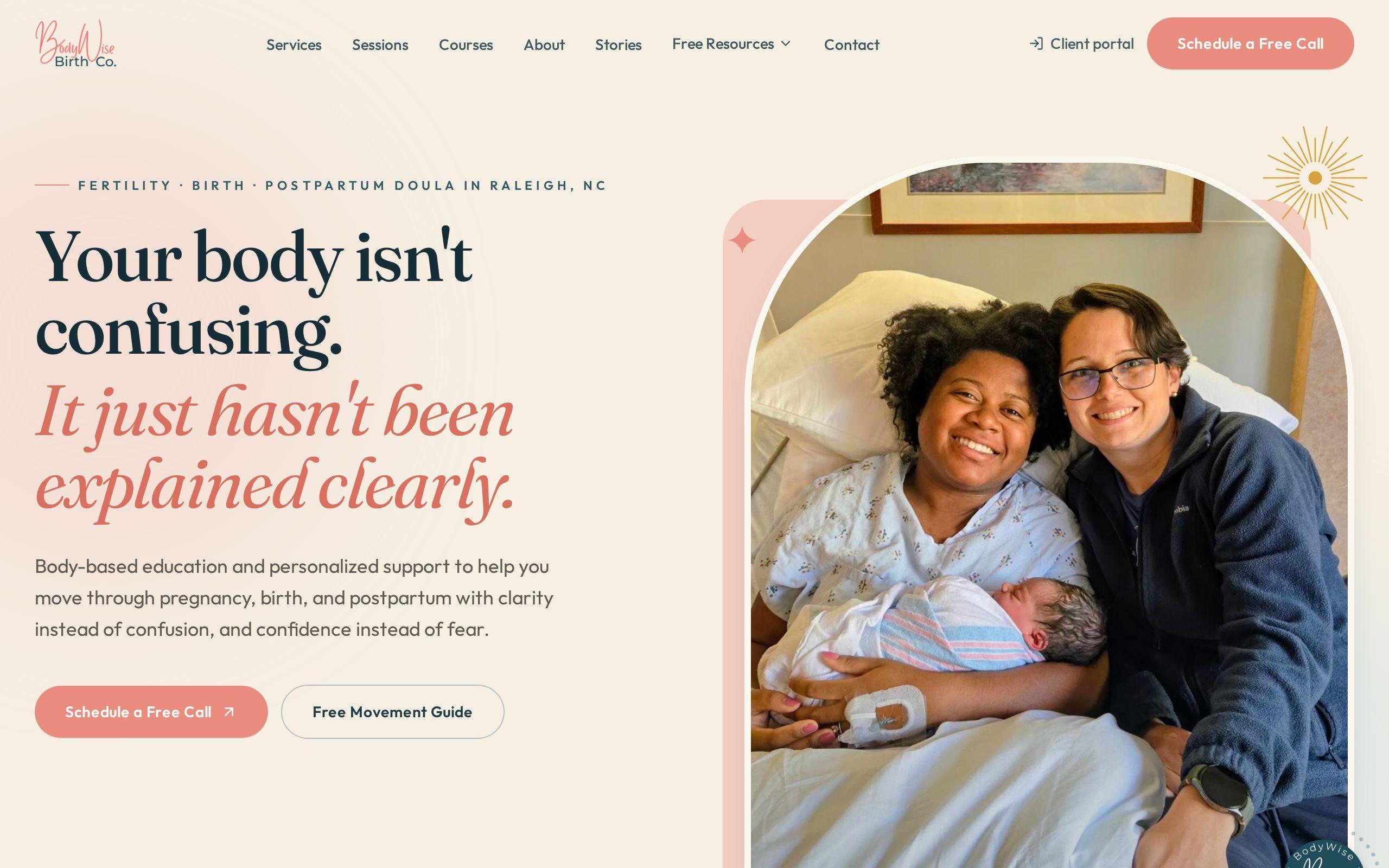
BodyWise Birth Co. is a Raleigh doula practice spanning fertility charting, birth support, and postpartum recovery, three different services for three different people at three different life stages. That's a lot of ways for a site to get complicated.
Instead of building three separate paths to three separate contact forms, the site routes every one of those paths toward a single action: a free 30-minute discovery call. Education content, birth stories, pricing, all of it leads to the same button. Scheduling and a client portal are wired directly into the site, so a visitor never has to leave to book, email to ask about availability, or wait for a callback.
That matters more in this category than most. A doula is selling trust before she's ever met the client. Making the next step small, free, and one click away removes the biggest reason an anxious expecting parent hesitates: not knowing what happens if they reach out.
How CS Medical Made Booking the Obvious Next Step
CS Medical faced a different problem. Healthcare visitors are deciding whether to trust an organization with their health, and clinical websites tend to bury that decision under jargon and form fields.
The fix wasn't a fancier scheduler. It was structuring the entire site so that booking an appointment is the clear next step from any page, and breaking services down into plain language so a visitor can identify what they need without a medical dictionary. The contact flow itself was calibrated for patients, not for the form-heavy defaults that healthcare sites default to out of habit.
Notice what these two case studies have in common. Neither one is a scheduling widget bolted onto an existing site. Booking is the organizing principle. Every page answers the same question: does this get someone closer to the appointment, or does it just sit there.
What Information Do You Need Before Someone Can Book?
Ask for less than you think you need.
Every field you add between "I'm interested" and "I'm booked" is a chance for someone to close the tab. For a first appointment or discovery call, you typically need:
- Name
- Phone or email
- The specific service or reason for the visit
- A time that works
That's it. Insurance details, full medical history, budget range, how they heard about you, all of that can wait until after the appointment is on the calendar. You're not filling out a permanent record. You're confirming that two people will be in the same place at the same time. Everything else is a second conversation, not a condition of the first.
How Do You Keep a Booking Flow Short Enough to Finish on a Phone?
Most of your booking traffic is going to arrive on a phone, often one-handed, often while doing something else. If your flow needs a laptop to complete comfortably, you've already lost a chunk of it.
A few rules that hold up:
- One screen, one decision. Don't ask for a service, then a provider, then a date, then a time, then contact info, across five separate steps if you can compress it to two or three.
- Big tap targets. A calendar grid designed for a mouse cursor is miserable on a five-inch screen.
- Autofill-friendly fields. Standard name, email, and phone fields, not custom formats that reject a paste.
- No required account creation. Making someone set a password before they can book a first appointment is how you lose them at the finish line.
If you can't complete your own booking flow, start to finish, on your phone in under a minute, neither can your visitor.
What Happens After Someone Books?
Booking isn't the end of the flow. It's the handoff.
The moment someone books, they need three things: a confirmation that it worked, a clear sense of what happens next, and an easy way to reach you if something changes. That's a confirmation screen, a confirmation email or text, and, ideally, a calendar invite they can accept with one tap.
This is also where BodyWise's approach pays off twice. Their client portal doesn't just handle scheduling, it gives the client somewhere to return to, which matters when the relationship spans a full pregnancy rather than a single visit. Not every business needs a full portal. But every business needs to answer, clearly, "what happens between booking and showing up?" Silence in that gap is where no-shows come from.
How to Test Your Booking Flow Before You Launch It
Before you call this done, run it yourself, as if you were a stranger who has never seen your site.
- Start from your homepage on a phone, not your booking page directly. Find the button the way a real visitor would.
- Time yourself. If it takes more than a minute or two to get from landing to confirmed, find the step that's slowing you down.
- Try it on a slow connection, not just your office WiFi. A speed test will tell you if your site is dragging before a single form field even loads.
- Book a real slot and confirm the email or text actually arrives, and actually says what you expect it to say.
- Ask someone outside your business, who has never seen the site, to book without help. Watch where they hesitate.
If you find yourself thinking "well, they'd probably figure that out," that's the part to fix.
Your Next Step
Pick the one action you most want visitors to book this week. Not eventually, this week. Write down the five pieces of information you actually need to confirm it, and nothing more. If your current site can't get a visitor from any page to that booking step in two clicks or less, that's the gap to close first. If you want a second set of eyes on where your flow is losing people, get started with a look at your site, or talk to us about custom web development built around the appointment you actually want on your calendar.