
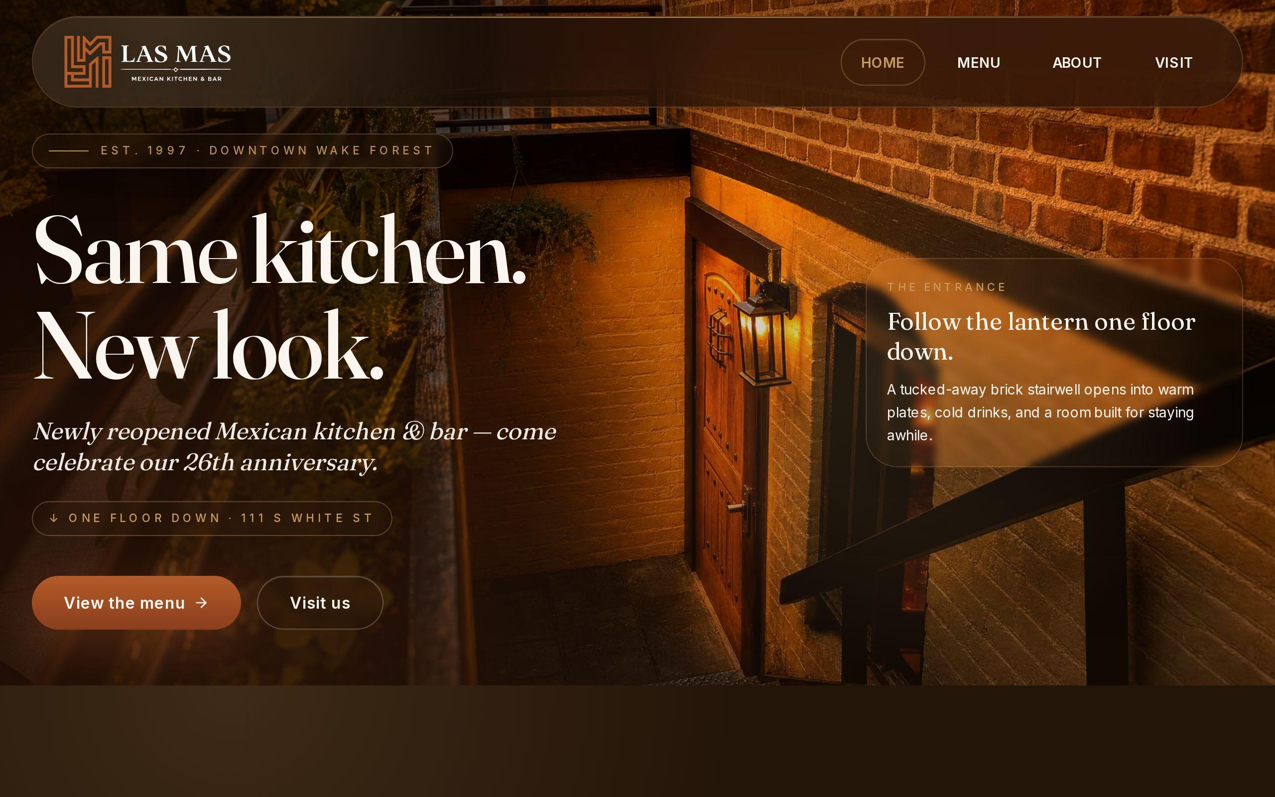
Twenty-five years in downtown Wake Forest earns a restaurant a reputation. It does not earn a website that works.
That was the starting point for Las Mas Mexican Kitchen & Bar. The restaurant did not need to be introduced to the town. It needed a site that held up on a phone, in the hands of someone deciding where to eat right now.
Here is the brief, the decisions we made, and what we would tell any downtown restaurant owner to copy.
What does a hungry diner on a Wake Forest sidewalk need in the first five seconds?
Three things. The menu, the hours, and the address.
That is the whole list. Not the history, not the mission, not a slideshow. A person standing on a sidewalk, or sitting in a parked car, or walking out of a shop nearby, has already half decided to eat. They are looking for a reason to say yes or a reason to move on.
So we treated those three answers as the product. Everything else on the site had to earn its place next to them.
Why does a slow site hand the diner to a delivery app?
Because the delivery app is always one tap away, and it never makes them wait for a menu to load.
Diners searching from the street need answers in seconds. Anything slower and they open an app instead. The restaurant may be a block away, but the app is on their home screen.
That is the real competition for a walk-in restaurant. Not the place across the street. The app that turns your menu into a thumbnail on someone else's platform.
A site that is clear, fast and honest about hours and location gives the diner a reason to walk instead. If you want to see where your own site stands, our speed test is a good place to start.
How did we keep the menu, hours and location one tap from every screen?
By deciding early that they were not content. They were navigation.
The menu, the hours and the location sit within one tap of every screen. Not just the homepage. A diner might land on any page, from a search result or a shared link, and they should never have to hunt.
This sounds obvious. It is also the thing most restaurant sites get wrong. Hours hide in a footer. The address is a paragraph. The menu is a PDF that opens in a new tab and needs pinching and zooming.
Our rule was simple:
- If a hungry visitor came for it, it stays within reach.
- If it is not what they came for, it can wait one scroll down.
- If a screen has no path to the menu, hours and location, the screen is unfinished.
Why let food photography do the selling instead of adjectives?
Because nobody was ever convinced by "authentic, flavorful and fresh."
Every restaurant says those words. A good photograph of the food says something none of them can. It makes the visitor hungry, and hungry people do not need persuading.
So we designed appetite-forward layouts. The photography leads, the type stays out of the way, and the copy does the practical work of telling people what and where.
This also keeps the page honest. A photo of the real plate sets the right expectation. The diner arrives knowing what they want to order.
The takeaway for your own site: if a sentence on your homepage could appear on any other restaurant's site, replace it with a picture of your food.
How do you carry 25 years of family history without an about page nobody reads?
You stop treating history as a separate room.
Most about pages are visited by almost nobody who is hungry. The story gets quarantined in a corner of the site, and the people who would love it never see it.
For Las Mas, we wove the twenty-five-year family story through the site instead. It shows up where it belongs, alongside the food and the place, as part of why this restaurant is what it is.
That changes what the history does. On an about page, it is a biography. Spread through the site, it is a reason to trust the kitchen. A diner who has never been in learns, without clicking anything extra, that this place has been feeding downtown Wake Forest for a quarter century.
What does designing for walk-in traffic mean for local search?
It means the same thing, viewed from a different angle.
A person searching from the street is on a phone, nearby, and ready to act. The site has to load quickly, read clearly on a small screen, and put the practical details first. Those are the habits that drive walk-in traffic to a downtown restaurant, and they are also what a local search needs to see.
So the build included local SEO alongside the design and development. We optimized for the local search and mobile behavior that actually sends people through the door.
The point is that these are not two projects. Design for the diner on the sidewalk, and you have mostly designed for local search. Treat them separately and you end up with a pretty site nobody finds, or a findable site nobody can use.
What should a downtown restaurant owner copy first?
Start with the thing that costs the least and matters the most.
Pull out your phone, stand outside your own restaurant, and try to find your menu, your hours and your address. Time yourself. If it takes more than a few seconds, or if you are pinching a PDF, you have found your first fix.
Then work down the list:
- Make the menu, hours and location reachable in one tap from every page.
- Replace your most generic sentence with a real photo of your food.
- Move your story out of the about page and into the places people already look.
- Check that your site loads quickly on a phone, not just on your office computer.
None of that requires a redesign to begin. All of it respects the person who is hungry and standing outside.
Where to go from here
You can see the finished work on the Las Mas case study page. If you run a restaurant and want to know how your own site holds up from the sidewalk, read about our restaurant website design or see how we approach custom web development.
Or do the five-minute version first. Stand outside your door, open your site on your phone, and find the menu, the hours and the address. Whatever slowed you down is where we would start.