
Your SaaS buyer does not trust software. That is the whole job of your marketing site right there.
They have been burned by vendors who oversold and underdelivered. So before they will book a demo, they want to evaluate you the way they evaluate the software itself: line by line, tier by tier, feature by feature. Give them too little and they leave for a competitor with a fuller spec sheet. Give them too much and they drown in documentation before they ever reach your signup button.
Most SaaS sites solve this by picking a side. Either they go thin and pretty, a brochure site that reads well but tells a technical buyer nothing they need to know. Or they go deep and exhausting, a wall of features with no clear next step. Both lose the sale. The site has to do both jobs, at once, on the same page.
The SaaS buyer's dilemma
A SaaS buyer is not shopping the way a retail customer shops. They are usually evaluating on behalf of a team, sometimes on behalf of a whole department, and they will be asked to justify the choice later. That means they need real information: what the tiers include, what the product actually looks like when it is running, how the pricing compares to whatever else is on their shortlist.
At the same time, that buyer did not come to your site to read a manual. They came to decide whether this is worth fifteen more minutes of their week. If the page cannot answer their questions fast, they assume the product cannot either.
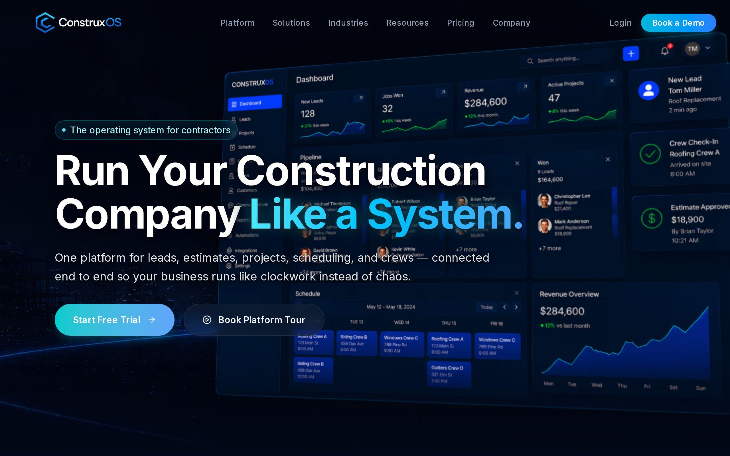
This is the tension behind every SaaS marketing site: enough depth to satisfy a technical evaluator, without so much friction that they leave before they act. We built our Construxos site around exactly this problem. Construction software is sold to buyers who are already skeptical of software, so the site had to prove the platform worked before it asked for a meeting.
Let tiered plans make their own case
The instinct with pricing pages is to explain everything, because you are afraid a buyer will pick the wrong tier or miss a feature. Resist that instinct. A pricing page's job is not to explain your whole product. It is to let each type of buyer recognize themselves in one tier and move on.
For Construxos, we built tiered product pages that let each plan speak to its own buyer directly, rather than making one buyer read three tiers' worth of copy to find the one that applies to them. A small contractor and an enterprise construction firm are not looking for the same things, and they should not have to dig through the same paragraph to find out which plan fits.
QuestBlue's cloud communications buyers operate under a harder version of the same problem. Telecom buyers compare providers line by line on capability and price, so vague pricing does not just underserve them, it disqualifies you from the comparison entirely. Our QuestBlue site published transparent pricing tiers specifically so buyers could qualify themselves against competitors without needing to call anyone first.
That is the real value of a good tiered pricing page. It is not a sales tool. It is a filter. It sends you fewer demo requests, but the ones you get are from people who already know your plan fits their size and budget. That is a better trade than more leads with less signal.
Show the product before the demo call
Ask any SaaS buyer what they want before a demo call and the honest answer is almost always the same: to see the thing working, without a salesperson in the room. A demo call is a commitment. It means blocking time, looping in a colleague, sitting through a pitch. A skeptical buyer wants to earn that commitment back before they make it.
This is why we designed client-portal previews for Construxos, so a prospect could see the actual platform before ever booking a call. It is the difference between "trust us, it does what we say" and "here, look." For a construction buyer who has already been sold software that didn't deliver, that second option is the only one that works.
QuestBlue's answer to the same instinct was depth instead of a walkthrough: feature-rich service pages detailed enough for a technical evaluator to actually compare capabilities against a competitor's page, side by side, without picking up the phone. Different product, different buyer, same underlying move: give them something real to evaluate before you ask them to talk to a person.
If your site's only proof is a paragraph of marketing copy and a "Book a Demo" button, you are asking for trust you have not earned yet. A preview, a walkthrough, a detailed feature page, any of these buys you credibility before the sales conversation even starts.
Make signup the one action that matters everywhere
Here is where a lot of feature-dense SaaS sites quietly fail. They do the depth well. Pricing is clear, features are documented, previews exist. And then the page has six different calls to action fighting for the same click: "Download the whitepaper," "Watch the video," "Talk to sales," "Start a trial," "Read the case study," "Subscribe to updates." Every one of those dilutes the one action that actually matters.
Construxos was structured around a single principle: every page treats the demo signup as the one conversion event that counts. Not a preferred outcome among several. The only one. Pricing pages lead there. Product previews lead there. The brand pages lead there. A buyer can arrive on any page of the site and never lose the thread of what to do next.
QuestBlue applies the same discipline to a much denser page. Even with feature-rich service pages built for detailed comparison, the signup path stays prominent throughout, so that depth never comes at the cost of the conversion. That is the real skill here. It is not choosing between depth and a clear CTA. It is building an information hierarchy where a buyer skimming for five seconds and a buyer reading for twenty minutes both land on the same next step.
If your site has more than one primary action per page, you do not have a content strategy. You have a menu, and buyers do not convert off menus.
Building a brand serious enough for a conservative industry
Depth and a clear CTA are not enough on their own if the site does not look like it belongs in the room. Construction, telecom, and most of B2B SaaS sell into industries that are inherently conservative about new vendors. A buyer in one of these categories is not just asking "does this software work." They are asking "is this company going to exist in three years, and will they pick up the phone when something breaks."
That question gets answered by the brand before it gets answered by the product. For Construxos, we built a full brand identity alongside the site, because a construction technology platform selling into a skeptical, established industry needed to look like it had staying power, not like a weekend project. A polished, credible visual identity is doing real trust-building work, quietly, on every page a prospect visits.
This matters even when your product is strong. A buyer will not read your feature list carefully if the page around it looks unfinished. They will assume the product is unfinished too.
While you are auditing how your site presents itself, it is worth checking something more basic: how fast it actually loads. A skeptical technical buyer notices lag before they notice your copy, and a slow page undercuts credibility faster than almost anything else on the site. You can run your own pages through our speed test to see where they stand.
What this means for your site
If you are running a B2B SaaS company, here is the honest check to run against your own site right now:
- Do your pricing tiers let a buyer place themselves without reading every word, or do they require a phone call to understand?
- Can a prospect see or experience something close to the real product before they book a demo?
- If you clicked through five random pages on your site, would every one of them point toward the same single action?
- Does the site look like a company that will still be answering support tickets in three years?
Most SaaS sites fail at least one of these. Fixing the fourth without fixing the first three just gets you a better-looking site that still leaks leads at the pricing page or drowns them in feature copy with no way out.
If you want a second opinion on where your own site is losing buyers between "interested" and "signed up," our custom web development team works through exactly this kind of build for SaaS companies. Or skip straight to it: tell us about your site at get started and we will tell you, specifically, what is costing you demo signups.