
A couple planning a small wedding is not shopping for square footage. They are shopping for a feeling. They want to picture the day, and they want to do it on their phone, at night, in about ninety seconds.
If your site cannot do that, the tour never gets booked. Here is what a micro wedding venue website has to do.
What do couples look for before they ever write to you?
They look for proof that the place is real, that it looks like the pictures in their head, and that it will work for a small guest list.
Most of them start with photos. They scroll before they read. Then they hunt for the basics: where it is, how many people it holds, whether the date is open, and how to ask.
Notice what is not on that list. Your founding story. Your mission statement. A paragraph about how you fell in love with the property. Those matter, but later. The first job is to make the place easy to picture and easy to ask about.
Why should the venue get its own page and inquiry path?
Because a couple and a florist customer want different things, and one contact form treats them the same.
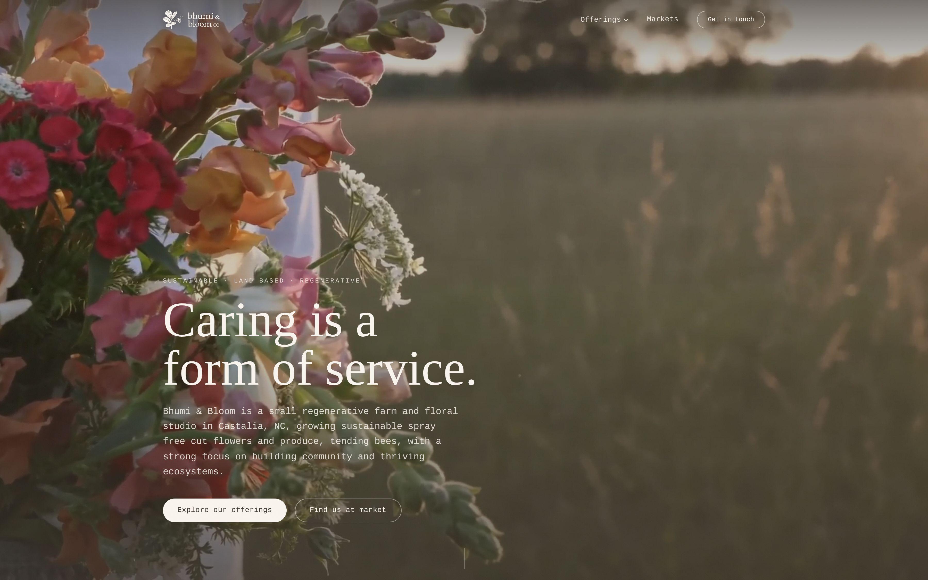
Take Bhumi & Bloom Co. It is four businesses under one name: a working regenerative farm, a floral studio, a micro-wedding venue and a workshop program. Each speaks to a different customer. A single generic template would have flattened them into an unfocused list of services.
So we structured the site around the four revenue lines. Each one has room to sell on its own terms. And each has an inquiry path tuned to its offer, so a micro-wedding lead and a workshop booking follow different routes. You can see the whole build in the Bhumi & Bloom case study.
The takeaway for your venue is simple. Give it a front door of its own.
How should photography carry the sense of place?
By showing the place, not the idea of a wedding.
Couples have seen a thousand stock photos of clinking glasses. They have not seen your land in late afternoon light. Make that the lead image. Then build the page around a few strong images instead of forty similar ones.
A few rules we use:
- Open with a wide shot that shows the setting, not a close-up of a centerpiece.
- Show the venue empty and show it dressed, so couples see both the bones and the possibilities.
- Include the approach, the entrance and the spots where guests will actually stand.
- Let images run large. Thumbnails in a grid waste the one thing you have going for you.
On the Bhumi & Bloom site, image-forward layouts let photography of the flowers, produce and land carry the brand's story. A venue beside a working farm has an unfair advantage here. Use it.
What belongs on a venue page besides pretty pictures?
The answers to the questions couples would otherwise have to email you to ask.
Every unanswered question is a small reason to close the tab. So put the practical facts where they can be found in seconds:
- How many guests the space suits, and what "micro" means at your venue
- What is included and what couples bring themselves
- Which dates and seasons you book
- Where it is, and how far from the Triangle's usual wedding spots
- What the tour looks like and how long it takes
Write these in plain language. A short list beats three paragraphs of lovely prose.
This also does something quietly useful. It filters. A couple who reads your guest range and still writes to you is a better lead than one who has to guess.
How do you handle a venue that sits inside a bigger business?
Let the bigger business support the venue, not crowd it.
If you run a farm, a florist shop or a workshop program next to the venue, the temptation is to put everything on one page and let visitors sort it out. They will not. They will leave.
Give each offer its own section of the site, then link between them where it helps a real person. A couple on the venue page might well want to know that flowers can come from the studio down the path. A short, clearly marked mention does that without pulling attention off the booking.
That is how we approached Bhumi & Bloom. Four lines, each with space, each with a clear route in. If your business looks like that, our farm and florist website design page goes deeper on the pattern.
Why does your regenerative or local story belong near the booking button?
Because it is the reason a couple chooses you over a banquet hall.
Anyone can rent chairs. What you have is a place with a point of view. At Bhumi & Bloom, that is a regenerative, spray-free farm. We wrote and designed the copy hierarchy so those practices read as the differentiator, not a footnote.
Do the same with whatever is true of your venue. Maybe the flowers on the tables were grown steps away. Maybe the land has a story. Say it once, clearly, near the photos and near the button. Not buried on an About page that couples never open.
Keep it honest and specific. Only claim what you actually do.
What should the inquiry form ask a couple?
Very little, and the right things.
A long form feels like paperwork. A one-line form gets you a vague note you then have to chase. Aim for the middle:
- Names and an email or phone number
- Preferred date, or a rough season
- Estimated guest count
- A single open field for "tell us about the day you imagine"
That last one is where the good leads reveal themselves. It also gives you something to respond to besides "thanks for your interest."
Then say what happens next. "We reply within one business day and offer tour times" is a promise that keeps couples from inquiring at three other venues. Only write it if you can keep it.
How do you get found when couples search for venues near them?
By making it obvious where you are and what you offer, in the words couples actually type.
Couples search by place and by size. They want something small, near home or near a place that matters to them. If your venue page never says where it is or that it suits small weddings, search engines have little to work with.
So name the area plainly. Describe the venue in the terms a couple would use. Give the venue its own page rather than a paragraph on a services list, so there is one clear thing for search to find. A dedicated page is also easier to point links at and to improve over time.
If you want help with the search side, that is the work of our SEO and analytics service. But the foundation is the page itself.
What should you fix first on your venue site?
Start with the thing that costs you the most tours, and that is usually one of three.
- No dedicated venue page. If the venue shares space with everything else, split it out first.
- Weak first image. Replace the lead photo with a wide, honest shot of the place.
- A generic contact form. Give the venue its own short form with a date and guest count.
Do those three and you have most of the gain. The rest is polish.
Your next step this week is small. Open your site on your phone, as a couple would, and time how long it takes to see the venue, learn what it holds and find the inquiry button. If that takes more than a few taps, start there. And if you would like a second pair of eyes, tell us about your venue.