
A buyer who has never met you will decide a lot in the first few seconds. If you are wondering what makes a professional services website look credible, start with this: the site is not a brochure about your work. It is a piece of your work.
Why is your website the first proof of how you work?
A bakery can win you over with a croissant. A software company can show a demo. A firm that sells expertise has neither. It has a promise, and a promise needs evidence.
The evidence a stranger can inspect right now is your website. How it looks, how it reads, how it behaves. Prospects assume the care you put into it is the care you will put into them.
That is unfair if your real work is better than your site. It is also how people behave. Nobody calls the firm with the sloppy site and hopes the sloppiness stops at the homepage.
How do typography and spacing signal the standard you operate at?
When there is no feature list doing the persuading, the small decisions do it instead. Type choice. Line length. How much room a headline gets to breathe.
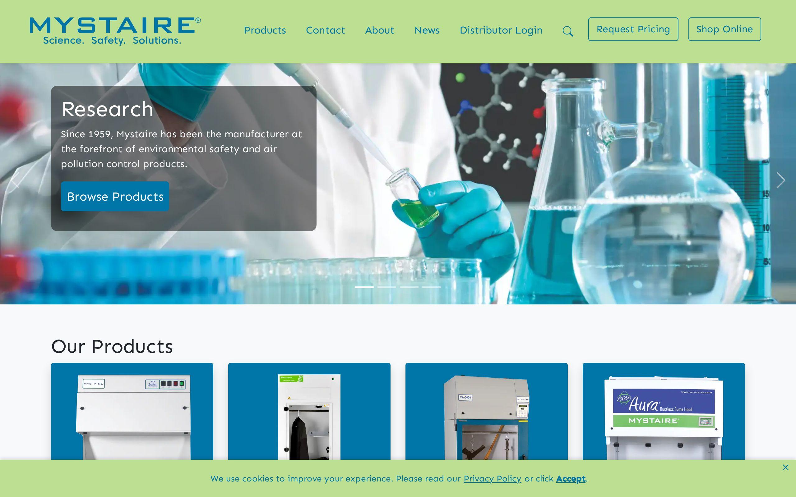
Our Mystaire project was built on exactly this premise. The company's goal was presence, and there was no product grid or price sheet to lean on. So the typography, spacing and pacing had to communicate the standard the business operates at. The brief allowed no rough edges, because the site itself was the evidence.
Here is what that means in practice:
- One or two typefaces, chosen with intent, and used consistently.
- Generous white space that says nothing is rushed.
- A visual identity precise enough to carry your positioning on its own.
Crowded pages say "busy." Unhurried pages say "confident."
What should the first screen say about your value?
Visitors should know within one screen what you do, who you do it for, and why that matters. Not a mission statement. Not a slogan that could belong to any firm in the Triangle.
Try this test. Cover your logo and read the headline. Could a competitor use it unchanged? If yes, rewrite it.
On Mystaire, the content was structured so the value proposition lands early without overselling. Early matters because attention is shortest at the top of the page. Without overselling matters because of what comes next.
A good first screen is short. One clear statement, one supporting line, one obvious next move. Everything else can wait.
Why does overselling cost you credibility?
Because experienced buyers have heard it all. "World-class." "Industry-leading." "Unmatched results." Each one invites a quiet question: according to whom?
Adjectives are cheap. Anyone can type them. A professional who is actually good tends to state things plainly and let the reader draw the conclusion.
Some habits to cut:
- Superlatives you cannot back up on the same page.
- Stacked buzzwords that say nothing about what you do.
- Exclamation points. All of them.
Understatement reads as security. If you were really the best in your field, you would not need to say so in 72-point type.
How do you replace a feature list when you have nothing to list?
Professional services firms often feel the pressure to invent a list. Seven pillars. Twelve capabilities. A grid of icons that all look vaguely the same.
Resist it. When your offer is judgment, access and experience, a padded list thins the message.
Instead, let the design do the persuading. Clean layouts that let quality show directly. Short passages of well-chosen copy. Pacing that moves the reader down the page one idea at a time, with room between each.
That was the approach on Mystaire: unhurried layouts, where the design communicates quality without a spec sheet to prop it up. If you have three things worth saying, say three things well. Do not pad to eight.
What small rough edges quietly undermine trust?
Buyers rarely say "your site felt off." They just do not call. The causes are usually small:
- A page that loads slowly or jumps around as it loads.
- Images that are blurry, stretched or obviously generic.
- Text that is hard to read on a phone.
- A broken link, a typo, a form that does nothing when you press submit.
- Inconsistent spacing and fonts from one page to the next.
Each one is minor. Together they tell a story about attention to detail, and attention to detail is exactly what you are selling.
Speed is the easiest of these to check. Our free speed test takes a moment and will tell you whether your site is making a slow first impression.
How should the site route a serious visitor to a conversation?
A credible site that leads nowhere is a very nice dead end. Professional services are sold through conversation, so the site should be built to start one.
Mystaire was designed with clear routes to direct engagement rather than passive browsing. That is the principle to copy. Browsing is what people do when they are not sure. Your site should give a serious visitor an easy way to stop browsing.
- Put a plain contact route in the header, and repeat it at the end of every key page.
- Say what happens next. "Tell us about your project and we will reply within a business day" beats a blank form, as long as you can keep the promise.
- Offer one primary action, not five competing ones.
If someone is ready to talk, do not make them hunt for the door.
How do you know the site is doing its job?
Start with the simplest question. Are the right people reaching out? Not more people, the right people. A credible site often brings fewer, better conversations.
Then read the inquiries you receive. Do they describe your work accurately? Do they arrive already respecting your pricing and your process? If so, the site is setting the standard before the first call.
Ask your newest clients what they thought when they first landed on the site. Their answers will be more useful than any dashboard.
And look at it yourself on a phone, on a slow connection, as a stranger would. If anything makes you wince, a prospect has already winced too.
What to do this week
Open your homepage on your phone. Read only the first screen. Write down what a stranger would think you do, and who for.
If it does not match what you actually do, that is your first fix. If you want a second set of eyes, our web development and brand development teams work on exactly this, and you can start a conversation with us any time.