
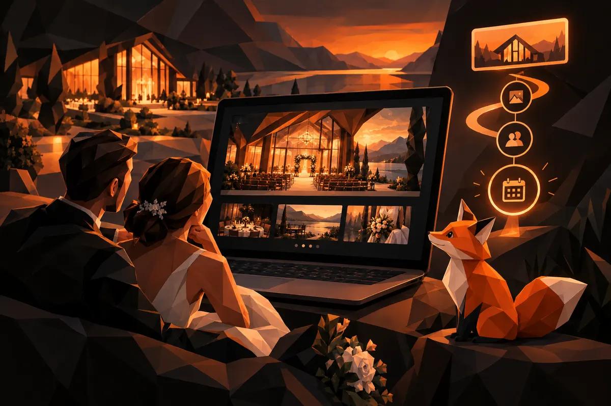
If you run a venue, you already know what happens on a tour. Couples walk in, go quiet, and look around. Then they say something like "oh, this is it."
Your website has one job: get them to that tour. Here is what we think it takes, drawing on the micro-wedding venue we designed for within Bhumi & Bloom Co.
What are couples actually looking for on a venue website?
Three things, in this order.
- Does this place feel right?
- Is it available and does it fit our day?
- How do we talk to a human?
Notice what is not on the list. Nobody opens a venue site hoping to read your mission statement.
So the question behind "what should a wedding venue website include" is really: what answers those three questions fastest? Everything else is supporting cast.
Why should photography of the place lead the page?
Because a venue is a place, and a place is sold by showing it.
A couple deciding where to get married is deciding where they will stand, where their people will sit, and what the light looks like at the moment it matters. Words about "a beautiful setting" do none of that work. Photographs do.
For Bhumi & Bloom, we built image-forward layouts that let photography of the flowers, produce and land carry the brand's story. That sense of place is why people choose a small local farm over a wire-service florist. It is also why a couple chooses an intimate farm venue over a generic banquet room.
Put the strongest images at the top. Make them large. Do not hide them in a thumbnail carousel.
What makes a good venue photo?
A few rules we hold to:
- Show the actual space, not stock imagery of a wedding somewhere else.
- Include wide shots so couples can judge scale, and close ones so they can feel texture.
- Show the place in different light and different seasons if you have them.
- Keep file sizes sane. A gorgeous page that takes forever to load loses the couple before they see it. You can check how your site loads in a minute.
How do you make the venue's difference read as a selling point, not a footnote?
Say it early, say it plainly, and put it in the hierarchy.
Bhumi & Bloom is a working regenerative farm. Its spray-free practices could easily have been a small line at the bottom of a page. We wrote and designed the copy hierarchy so those practices read as the differentiator instead. The same thinking applies to a micro-wedding venue. Small gatherings on a working farm are not a limitation. They are the point.
Ask yourself what a couple cannot get at the next venue. Then make that the second thing they read, right after the photographs.
What does a footnote look like?
You have probably seen it. A paragraph near the bottom that starts "We are also proud to..."
If your difference lives there, move it. A good test is to cover the page and read only the top of it. Could a stranger tell why your venue is not the others?
Should a venue site give each offer its own inquiry path?
Yes. If your brand sells more than weddings, this is the biggest structural decision on the site.
Bhumi & Bloom is four businesses under one name: a farm, a floral studio, a micro-wedding venue and a workshop program. Each speaks to a different customer. We structured the site around those four revenue lines so each has room to sell on its own terms, instead of competing on one crowded page.
Then we designed inquiry paths tuned to each offer. A micro-wedding lead and a workshop booking follow different routes.
Why? Because a couple planning a wedding and a person curious about a workshop are in completely different moods. One form for both asks the wrong questions of everybody.
What should the inquiry form ask a couple?
Less than you think, but the right things.
A couple is about to hand a stranger their date and their dream. Make it easy. A good wedding inquiry form asks:
- Names and the best way to reach them
- Their preferred date, or a range
- Rough guest count
- How they picture the day, in a sentence or two
- How they found you, if you want to know what is working
That is enough to reply with something useful. Save the long questionnaire for after they have booked a tour.
Two more details matter. Label the button for what happens next, such as "Request a tour," rather than "Submit." And tell them when to expect a reply. Couples shopping venues are often writing to several at once, and the first helpful answer has an edge.
How do you keep a venue page from competing with your other services?
Give the venue its own page, its own navigation entry and its own call to action. Do not make it a tab inside a services list.
On a multi-line brand, every extra offer on a page is a chance for the visitor to wander. A couple who lands on the venue page should not be offered produce boxes in the sidebar. The flower work can still appear, since a farm florist is a real draw for a wedding. But it should support the wedding story, not compete with it.
The rule is simple. One page, one customer, one next step.
If your brand looks like Bhumi & Bloom, with a farm, a florist and a venue under one roof, our guide for farm and florist website design covers the wider picture. You can also read the Bhumi & Bloom case study to see how the four lines fit together.
How does local search help couples find a Triangle-area venue?
Many couples start with a search that includes a place name. Raleigh, Durham, Cary, Chapel Hill, or simply "near me."
That means your venue page should say where you are, clearly, in real sentences and in the page title. It should be its own page, not a paragraph on a general services page, so a search engine has something specific to show for a venue search.
Beyond the page itself, keep your business listing details accurate and match them to what your site says. If you want help with the search side, our SEO and analytics work is built around exactly this kind of local visibility.
What should you fix on your venue site first?
Do these in order. Stop when you run out of time.
- The first screen. Is there a large photograph of your actual place, and a sentence about what makes it different?
- The call to action. Does one clear button say what happens next, such as "Request a tour"?
- The form. Does it ask only what you need, and does it live on a path made for couples?
- The page's focus. Is anything on it pulling a couple toward another service?
- The location signals. Does the page say where you are?
Most venue sites we see need the first three. They are also the cheapest to fix.
Open your venue page on your phone tonight, scroll once, and write down the first thing that does not feel like your place. Fix that one first.