
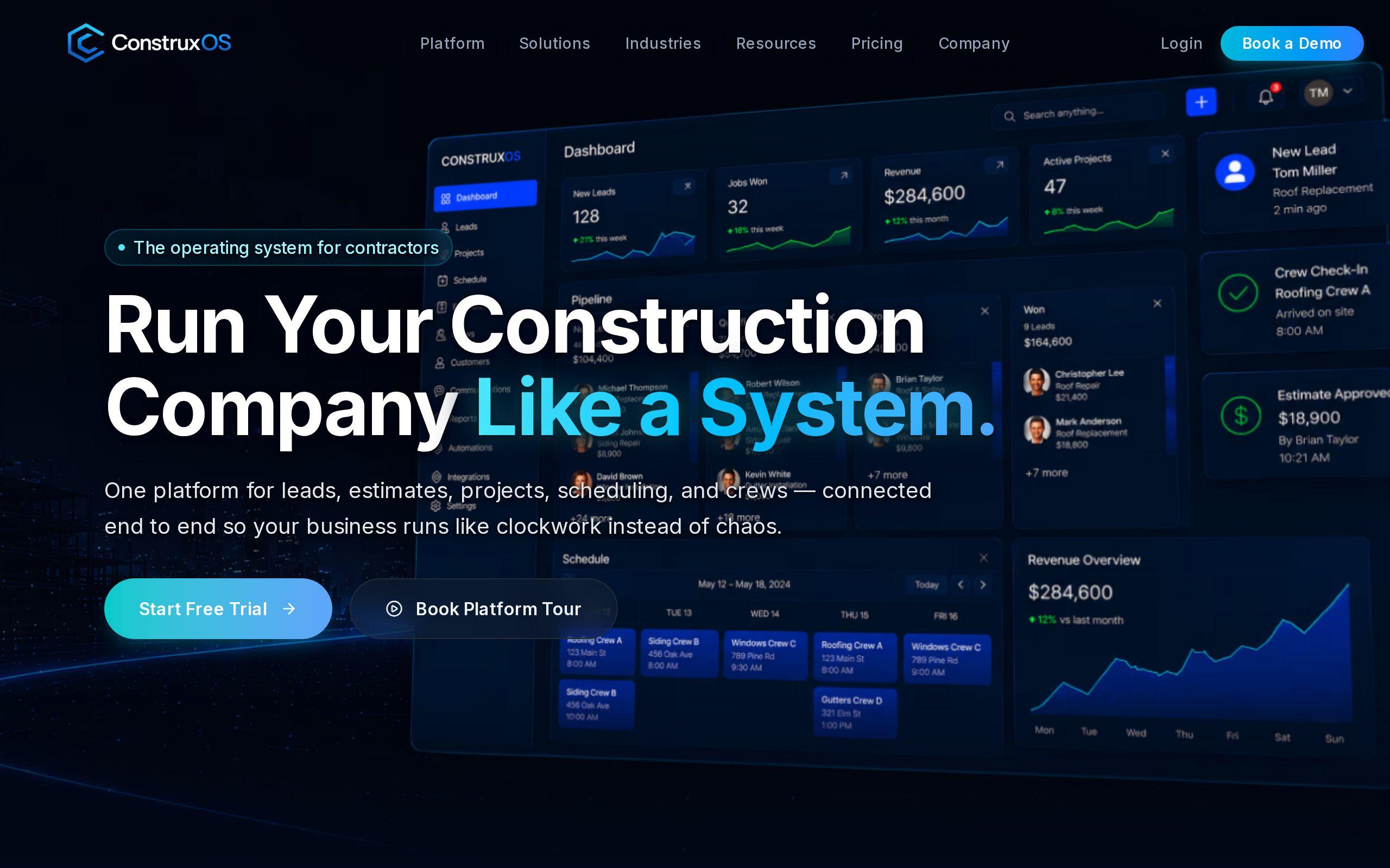
Construction people do not trust software. Not because they're behind the times, but because they've been burned by it. Somebody sold their company a platform three years ago that promised to fix scheduling, and it's still sitting there half-used, hated by the crew, defended by whoever bought it. That history is baked into every visit a construction technology company gets on its website.
Construxos came to us needing a marketing site and a full brand identity for exactly that buyer. The product is real. The skepticism is real too. The site had to do something harder than most SaaS sites: sell software to people who assume software is a waste of money until proven otherwise, and do it across multiple pricing tiers without turning into a technical manual.
Here's how we built it, and why.
The brief: selling software to a skeptical industry
Most SaaS marketing sites can lean on a simple formula. Explain the problem, show the product, list the features, ask for a signup. That formula assumes a buyer who's already comfortable evaluating software on its own terms.
Construxos's buyer isn't that person. They want to see the platform actually working before they'll agree to a demo call, because a demo call is a time commitment and their default assumption is that it won't be worth it. At the same time, Construxos sells a tiered product, which means the site has to explain who each tier is for. Do both badly and you end up with a site that reads like documentation: accurate, thorough, and completely unpersuasive.
The brief was to build a brand and a site that could carry both jobs at once. Look credible enough for a conservative industry. Prove the product works before asking for anything. And do it without drowning the pitch in feature lists.
Letting each pricing tier make its own case to its own buyer
A construction technology platform with multiple tiers is really selling to multiple buyers. The owner of a five-person crew and the operations lead at a multi-site contractor are not looking for the same thing, even if they land on the same pricing page.
We built tiered product pages that let each plan argue for itself, to its own buyer, on its own page. Instead of one comparison table trying to speak to everyone at once, each tier gets the room to make the case that actually matters to the person considering it. That's a structural decision, not a copywriting trick. It changes what the page is allowed to talk about and in what order.
This matters more in construction than in most software categories, because the buyer already suspects the vendor doesn't understand their specific situation. A page that speaks precisely to a five-person crew, instead of gesturing at "teams of all sizes," is doing real credibility work before a single word of copy tries to persuade anyone.
Giving prospects a look inside the platform before the demo
The biggest structural decision on the site was the client-portal previews. Construction buyers don't want to book a call to find out what the software looks like. They want to see it first, then decide if a call is worth their time.
So the site shows the platform, not just describes it. Prospects can see what the client portal actually looks like before they commit to anything. That's a different kind of proof than a features page or a testimonial, because it doesn't ask the visitor to trust anyone's word for it. It lets them look.
This is also why a demo signup, not a "contact sales" form, is the right ask. A demo is something a skeptical buyer can agree to once they've already seen enough to believe it's worth their time. Asking for a sales call before that point asks for trust the site hasn't earned yet.
If you're weighing whether your own product pages need this kind of preview before a gate, our Custom Web Development work is built around exactly this kind of structural decision, not just page design.
Building a brand identity serious enough for a conservative industry
None of the structural decisions above matter if the site looks like it was built by people who don't understand the industry. Construction is a visually conservative field. Contractors and site managers are quick to write off anything that reads as flashy, trendy, or built for a different kind of buyer entirely.
That's why the Construxos brief included a full brand identity, not just a website skin. We developed the brand to support a platform that's selling into an industry where the wrong visual tone costs credibility before the copy gets a chance to say anything. A construction technology brand has to look like it was built by people who've been on a job site, or at least people who respect the people who have.
Brand and site design aren't separable here. The site has to feel consistent with the brand at every tier page, every portal preview, every signup form, because a skeptical buyer is scanning for reasons to distrust the vendor. Inconsistency is one of the easiest reasons to find.
Our Brand Development work on Construxos was built to hold up under that kind of scrutiny, not just to look good in a style guide.
Why every page points back to one conversion event
Here's the part that ties the whole site together. Construxos has tiered pricing, portal previews, brand pages, and more, but there is only one conversion event that matters: the demo signup.
We structured every page around that single event on purpose. It would have been easy to scatter calls to action across the site: newsletter signups, resource downloads, contact forms, live chat. Each one might look like it's adding a conversion path. In practice, they compete with each other and dilute the one action that actually moves a prospect toward becoming a customer.
Treating the demo signup as the only conversion event that matters forces clarity everywhere else. The tiered pages build the case for a specific buyer. The portal previews build proof. The brand builds trust. All of it leads to the same door. That's a discipline decision as much as a design one, and it's the reason the site works as a system instead of as a collection of well-designed pages.
You can see how it all comes together on the Construxos case study, or look at the live site directly.
Where this leaves you
If your site is trying to do everything at once, contact forms, resource libraries, chat widgets, three different signup flows, ask which one of those is your actual conversion event. If you can't answer in one sentence, that's the first thing to fix, not the design.
A useful next step: run your own site through our free speed test and see how it performs before a visitor even gets to your pitch. If you're ready to talk through a rebuild that's built around one clear conversion event, get started and we'll walk through it.