
What Does a Website Have to Do When the Goal Is Presence, Not a Sale?
Most business websites sell something specific. A product, a quote, a booking. The design supports the pitch, but the pitch does the work.
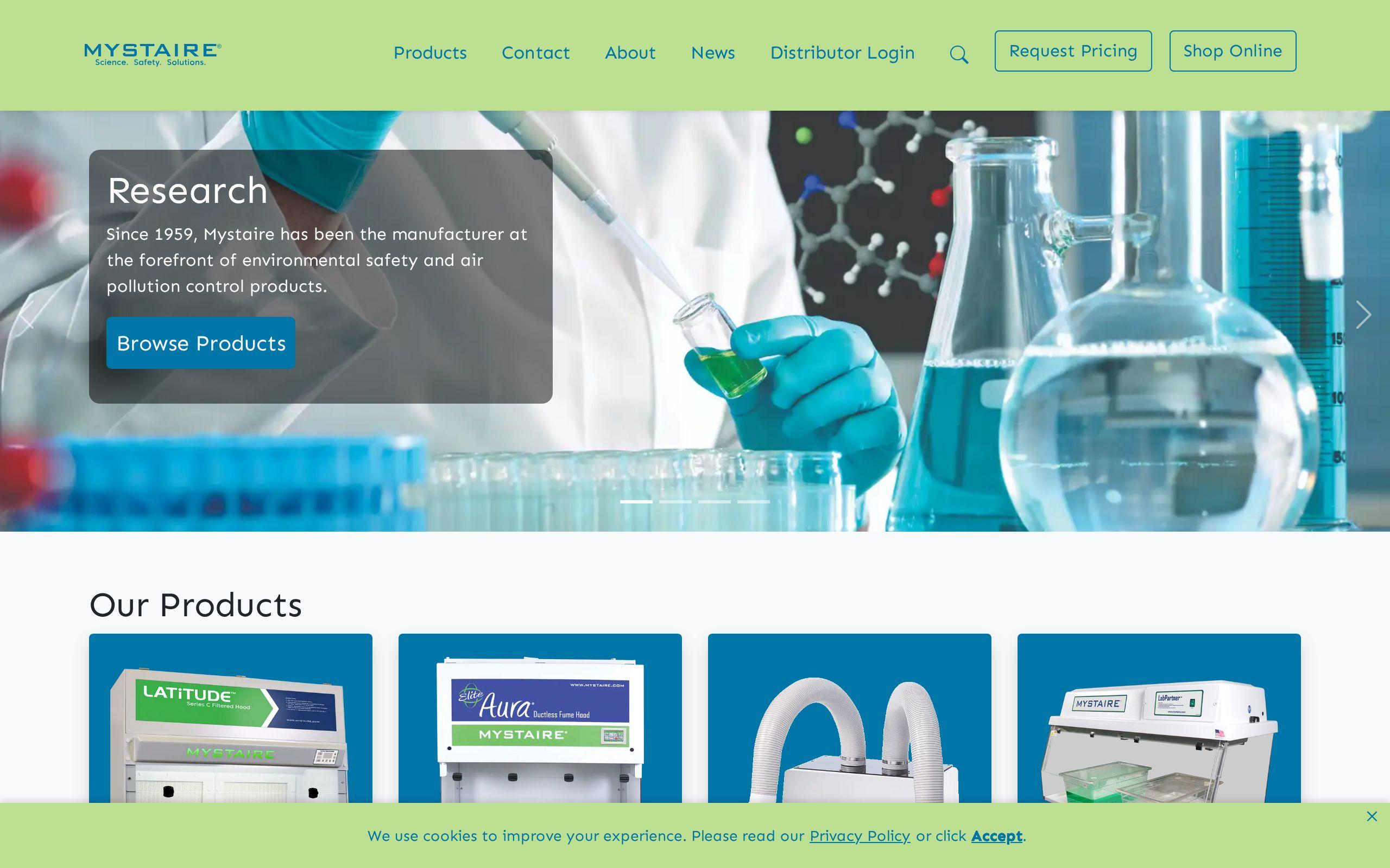
Mystaire's site had no pitch to lean on. It's a professional services brand, and the goal wasn't to move a visitor toward a cart or a price sheet. It was to establish that this company operates at a certain standard, full stop.
That's a harder brief than it sounds. Without a feature list or a price comparison to anchor the page, every visual choice has to carry weight it wouldn't normally carry. Type size. Line spacing. How long a section runs before it breaks. None of that is decoration when there's nothing else making the case. It is the case.
We took that brief literally. If the site was the evidence, the evidence had to hold up to close reading, because a presence-driven audience reads closely.
Why Was Mystaire's Brief Different From a Typical Lead-Gen Site?
A lead-gen site optimizes for one thing: getting a visitor to convert before they leave. Every section earns its place by moving someone closer to a form fill.
Mystaire's brief inverted that pressure. The instruction was explicit: no rough edges, because the site itself is the evidence. That's a different design problem. You're not building urgency. You're building trust, and trust doesn't respond to urgency, it responds to consistency.
The Mystaire case study covers the full brief, but the short version is this: the business's positioning depends on being seen as precise and considered. A site with a slightly-off heading size or an inconsistent spacing rhythm would have undercut that positioning before a single word was read. So the project's success criteria weren't conversion rate. They were whether the site felt as exact as the brand claims to be.
How Did Typography and Spacing Carry the Brand's Positioning?
We developed a visual identity precise enough to carry Mystaire's positioning on its own, without copy doing the explaining. That's a specific kind of discipline.
Typography set the tone first. Type choices, weights, and sizing had to feel deliberate at every scale, from a large headline down to a caption. Nothing arbitrary, nothing borrowed from a template. When type is consistent and considered, a reader registers "this company is careful" before they've processed a single sentence.
Spacing did the rest. Generous, consistent spacing signals confidence. A business that crowds its page is a business that feels it has to fight for attention. A business that gives its content room to breathe is telling you, implicitly, that it doesn't need to. That distinction matters most for professional services buyers, who are usually evaluating judgment as much as output.
Precision here isn't a style. It's the argument. A firm that gets its own typography wrong is not a convincing messenger for getting anything else right.
Why Build Clean, Unhurried Layouts Instead of a Feature-Packed Page?
It would have been easy to fill Mystaire's site with sections. More proof points, more logos, more copy explaining why the brand is credible. That instinct is understandable and it's usually wrong.
We built clean, unhurried layouts instead, and let the design communicate quality directly. A page that takes its time signals that the business behind it isn't rushed either. That's the opposite of what a feature-packed page communicates, even when the features are true.
This is the part of the brief that's easiest to get wrong under pressure. Stakeholders often want to add "just one more section" to be safe. But a presence-driven site isn't judged on how much it says. It's judged on whether what it says feels earned. Unhurried pacing is a discipline decision as much as a design one, and it only works if every section that stays has already proven it deserves the space.
How Was the Value Proposition Structured to Land Without Overselling?
Structure did work that copy alone couldn't. We ordered Mystaire's content so the value proposition lands early, without overselling it.
That's a narrower target than it sounds. Land it too late, and a visitor forms their own impression before you've said anything, usually the wrong one. Land it too hard, and the tone shifts from confident to defensive, which undercuts the whole premise of a presence-first site.
The fix was sequencing, not volume. Say the core positioning clearly, early, once. Let everything after it support that claim through tone and pacing rather than repeating it. A presence site earns trust by seeming like it doesn't need to convince you. The moment it starts working too hard to prove a point, that trust erodes. Restraint, applied deliberately to structure, is what let the value proposition register without reading like a sales pitch dressed up in nice type.
What Routes Did the Site Offer for Direct Engagement?
Presence isn't the same as passivity. A site can establish credibility and still fail if a convinced visitor has no clear next step.
We designed clear routes to direct engagement rather than passive browsing. That means the path from "this firm seems credible" to "let me reach out" is short and obvious, not buried under navigation or hidden behind generic contact language. Our own approach to that first step lives at Get Started, and it reflects the same logic we applied to Mystaire: once someone is convinced, don't make them hunt.
This is where a lot of presence-focused sites quietly fail. They spend all their design budget on tone and none on the moment a visitor decides to act. Mystaire's brief didn't allow for that gap. The standard of no rough edges applied to the entire path, not just the parts that looked good in a mockup.
What Would a Rough Edge Have Cost This Brand?
Here's the honest answer: on this kind of site, a rough edge doesn't cost a conversion. It costs the whole argument.
Slow-loading pages, inconsistent spacing, a heading that breaks awkwardly on mobile. On a feature-driven site, a visitor might forgive those things because the product still works. On a presence-driven site, there is no product to fall back on. The site is the only thing being evaluated, so any flaw reads as evidence against the brand's core claim.
That's also why performance matters just as much as polish for a site like this. A refined-looking page that loads slowly is contradicting itself. If you want a read on where your own site stands on that front, our speed test is a fast way to check.
What Can Other Professional Services Firms Take From This Approach?
Most professional services firms don't have a product demo to lean on either. They have judgment, reputation, and relationships, and a website that has to represent all three without overstating any of them.
The takeaway isn't "use more whitespace." It's that when nothing else is making your case, everything on the page is making your case, whether you intended it to or not. Typography, pacing, spacing, and sequencing aren't finishing touches. They're the argument itself.
If your firm sells trust and judgment rather than features and pricing, treat your website's design as due diligence, not decoration. Start by reading the full Mystaire case study, then look at what brand development would need to look like for your firm to make the same argument, this cleanly.