
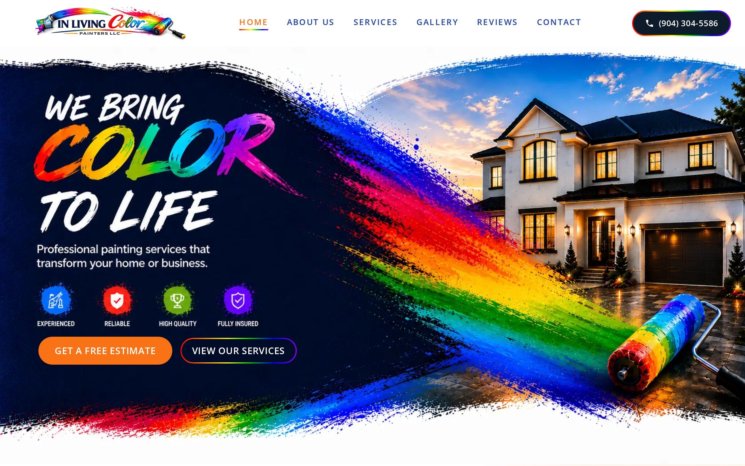
A homeowner who hires a painter is handing a stranger the keys to their house. That is a bigger ask than it sounds.
Most painting websites forget this. They lead with a slogan, a stock photo of a smiling person with a roller, and a quote form somewhere near the bottom. We took a different route for In Living Color Painters. Here is what we decided and why.
Why do homeowners trust photos before they trust copy?
Anyone can write "quality workmanship" on a website. Everyone does. The phrase has stopped meaning anything.
A photo of a finished room is harder to fake. The homeowner can look at the crisp line where the wall meets the trim and decide for themselves. No adjective required.
That is why we treat a portfolio of real work as the strongest trust signal in the trades. It does the persuading so the copy does not have to.
What was the brief?
The brief was short and clear. Build a site that proves competence through finished work. Then remove every step between a homeowner deciding to inquire and the inquiry arriving.
Two jobs, in that order:
- Prove it. Show the work before making any claims about it.
- Make it easy. Once someone is convinced, get out of their way.
Notice what is not on that list: clever branding, animation, or a long company history. Those are fine in their place. They were not the job.
You can read the full write-up on the In Living Color Painters case study page.
Why does finished work lead the page instead of stock photography?
Stock photos are a quiet confession. They tell the visitor that the company either has no good work to show or did not think to show it.
Neither is the message a painter wants to send.
So the site leads with photography of completed jobs. Real houses, real rooms, real results. A homeowner scrolling on their phone gets proof in the first few seconds, before they have read a word.
If you run a trade business, here is the test. Cover your logo and look at your top screen. Could it belong to any painter in any city? If so, it is not working for you.
How short can a quote form be and still be useful?
Shorter than you think. The form exists to start a conversation, not to finish an estimate.
A painter does not need a homeowner to describe every wall in a form. The painter needs to know who is asking, how to reach them, and roughly what the job is. Everything else can be a phone call or a site visit, which is where a good painter does their best selling anyway.
Our position: if a question can wait until the first conversation, it does not belong on the form. Each extra field is a small tax on the person who already decided to reach out. Some of them will not pay it.
Why design the form to be finished one-handed?
Because that is how people actually use their phones. On a couch, in a driveway, standing in a half-taped hallway with a coffee in the other hand.
A painting contractor quote request form for mobile has to work in that moment. So the quote flow on this site was built to be short enough to finish on a phone, one-handed.
In practice, that means a few habits worth copying:
- Fields large enough to tap without zooming.
- Only what the painter truly needs to respond.
- A clear, single action at the end.
- No reason to leave the page and hunt for something.
The thumb is the constraint. Design for the thumb.
How do homeowners find their own job in seconds?
Homeowners do not think in your internal service categories. They think "my kitchen cabinets are ugly" or "the outside of my house is peeling."
So the services on this site are laid out for self-identification. A visitor should glance at the page and think, that one is me. A few seconds, no reading required.
This matters most on mobile, where a wall of text gets abandoned. Clear labels, scannable groupings, and a path from each service straight to the inquiry do more than a polished paragraph about your process.
If your visitor has to work out which service applies to them, they are doing your job for you. Most will not bother.
Does looking current really matter in a dated category?
Yes, and for a reason beyond taste. A dated site makes a visitor wonder what else is dated: the insurance paperwork, the equipment, the attention to detail.
Painting is a category full of tired templates. That is an opening. Clean, current visuals separate In Living Color Painters from the sites a homeowner has already clicked away from that afternoon.
Looking current is not about trends. It is about signaling that someone is paying attention. For a company whose whole pitch is careful, tidy work, the website is the first sample of it.
The same principle runs through our contractor website design work generally.
What should you check on your own painting website this week?
Pick up your phone and run through this list. It takes ten minutes.
- Look at the first screen. Is it your finished work, or a stock photo?
- Find the quote form. How many taps and scrolls did it take?
- Fill it out with one hand. Where did you stumble?
- Count the fields. Which ones could wait for a phone call?
- Check your services. Could a homeowner spot their job in a few seconds?
- Check the speed. A slow page loses people before they see a single photo. Our speed test will tell you where you stand.
Write down what annoyed you. Your customers feel the same friction, they just do not tell you about it. They leave.
If the list turns up more than a few problems, this is the kind of work our custom web development service is built for. But start with the phone and a stopwatch. That costs nothing.