
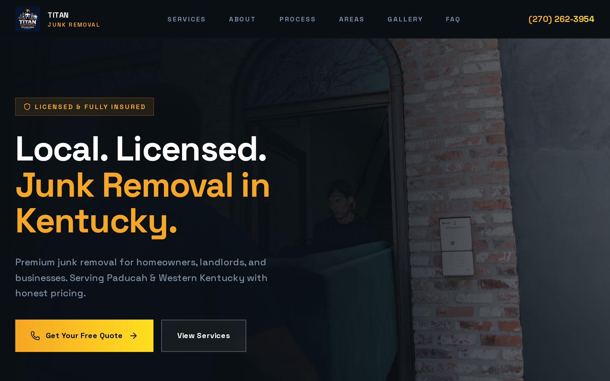
Junk removal is not a considered purchase. Someone is standing in a garage full of things they want gone, phone in hand, and they are going to call somebody in the next few minutes.
That moment shaped everything about the Titan Junk Removal identity. Here is how the project came together, and what you can borrow if you run a hauling or home-service business in Raleigh or anywhere else.
Why does a family-owned hauler need a brand that looks franchise-sized?
Because the customer cannot see your crew, your truck or your reputation. They see a small rectangle on a search results page.
On that page, your family-owned business sits next to national franchise brands with large budgets and polished marks. If your logo looks like an afterthought, the customer assumes the service is too.
You do not need to pretend to be a franchise. You need to look like a company that shows up, does the job and has done it before. Substantial is the goal. Big is not.
What did the Titan Junk Removal brief ask for?
The brief was short and honest. Junk removal is urgent and phone-first. A desktop-shaped website with a contact form is the wrong tool for that moment. And a family-owned operator still has to look strong enough to compete with national names.
So the work came down to four jobs:
- Design mobile-first, with the phone as the primary layout.
- Make click-to-call the dominant action.
- Build a bold gold-on-dark identity that holds up in crowded local results.
- Structure the site for local SEO so it competes on home ground.
The services behind it were web design, brand development, custom web development and local SEO. Those are not four separate projects. They are one answer to one question: who gets the call?
The finished work is on the Titan Junk Removal case study page.
Why does gold on dark stay legible in a crowded search results page?
Search results are a wall of similar things. Small logos, similar names, similar stars. A brand that blends in gets scrolled past.
A gold mark on a dark field does the opposite. Gold reads as strong and established. Dark gives it contrast, so the mark stays clear at thumbnail size.
That matters more than it sounds. Your customer is not at a desk with a calibrated monitor. They may be outside, squinting, one-handed.
A distinctive color pairing also makes you recognizable. A customer who has seen the color on a truck and then sees it on their phone does not need to think. They just recognize you.
Why was the phone screen the primary layout, not an afterthought?
Many sites are designed on a big monitor and then squeezed down. Everything important gets pushed below the fold, and the phone version feels like a compromise because it is one.
On Titan, the phone layout came first. The desktop version grew out of it.
That means the first screen a visitor sees should answer the only questions that matter:
- Who are you?
- Do you do what the visitor needs?
- How do they reach you right now?
It also means designing for thumbs. Nothing should ask the visitor to pinch, hunt or wait.
For a rough check on your own site, run it through our speed test. A slow page on a phone is a lost call.
How does one dominant call button shape every page?
Here is our position: on a junk removal site, the call button is the product.
Click-to-call is the dominant action throughout the Titan site, because that is how the category actually converts. A customer in a garage does not want to fill out a form and wait for an email. They want a human on the line.
So every page is built around one question. Where is the next tap going to be?
That sounds like a small decision. It changes a lot:
- Anything that competes with the call gets quieter.
- Copy stays short, because nobody reads an essay before calling.
- The brand and the action pull in the same direction, so the look that makes you memorable also points at the button.
How do the identity and the local SEO structure support each other?
A good-looking brand that nobody finds is a hobby. A well-ranked site that looks forgettable wastes the click.
Structure gets you into the results for the services and places you cover. Identity makes the customer choose you once you are there.
Titan was built for local SEO so it could compete with national franchises on home ground. Home ground is the key phrase. A franchise has a name. A local hauler has the town, the neighborhoods and the people who live nearby.
A consistent name, a clear service focus and pages that speak to the places you serve all give search engines something clean to read. A recognizable look gives people something to remember. Our SEO and analytics work covers how that structure gets built.
What can a small hauler copy without a full rebrand?
You may not need a new logo. You may need a few decisions.
- Pick one high-contrast color pair and use it everywhere. Truck, site, listings, invoices.
- Put your phone number where a thumb can reach it. Make it a tap, not text to copy.
- Cut the first screen down. Name, service, area, call button.
- Make the contact form the backup, not the main path.
- Keep your name and service wording identical on your site and your listings.
None of that needs a big budget. It needs a decision that the phone is the real storefront.
How do you judge whether your brand holds up next to the franchises?
Try this tonight. Pick up your phone and search for your service plus your city, the way a stranger would.
Now read the results as a customer, not as the owner. Ask three questions:
- Can you tell who the business is at a glance, or does it blend in?
- Can you read the logo and name at thumbnail size?
- Once you tap through, how long does it take to find a way to call?
If you stumble on any of those, a competitor with a bigger name may be winning a call it did not earn. That is fixable.
Start by writing down what you see in that search. That list is your brief. If you want a second set of eyes on it, our brand development page explains how we approach it.